NEW HIGH SCORE!
Enter Your Initials
Score: 0
Click Log-in to view the portfolio.

I'm a Digital Content Strategy, Product & Growth professional with 8+ years' experience leading digital content, customer journeys and product experiences within technology-focused businesses. Throughout my career I've taken ownership of the strategy, development and continuous optimisation of websites, learning platforms, marketing content and digital products, ensuring every initiative supports measurable business objectives.
I specialise in building content ecosystems that improve discoverability, engagement and conversion across the entire customer journey. Combining UX research, analytics, SEO, AI Optimisation (AIO), experimentation and user behaviour insights, I've delivered content strategies that improve search visibility, increase customer engagement and drive commercial growth.
Working across Product, Marketing, Sales, Learning & Development, Technical Support and leadership teams, I've aligned digital content with wider business priorities, reduced duplication, improved consistency and helped deliver scalable customer experiences. I'm comfortable coordinating stakeholders with different priorities and translating business goals into practical digital solutions.
Alongside strategy, I'm a hands-on technical practitioner with experience using HTML, CSS, JavaScript, PHP, SQL, React and APIs. This enables me to move seamlessly between strategic planning and implementation, whether launching new digital products, optimising conversion funnels, developing internal systems or improving digital experiences through continuous iteration.
My approach is highly data-driven. I use analytics, user research and performance insights to identify opportunities, measure impact and continually refine content and product performance. I enjoy solving complex business problems, simplifying customer journeys and building digital experiences that create measurable commercial value.
Outside work, I enjoy strength training, hiking, mountain climbing and badminton. After nearly ten years playing rugby, I've developed a collaborative, resilient and continuously improving mindset that I bring to every project and team I work with.
Twelve projects written in Google-style STAR format (Situation, Task, Action, Result). Select a case study to open the full write-up in the browser.
Decision-support UX across Cloud, Cyber, Data and AI pathways to reduce ambiguity and improve enquiry quality.
Behavioural analytics across email, landing pages, webinars and CRM to improve segmentation and funnel visibility.
STAR: restructuring — streamlined ops while protecting revenue-critical digital work.
Modernised mock exam, results and revision flows so students could progress with clearer feedback and less manual support.
Responsive course and subscription website connecting learners with training, practice exams and a dedicated student portal.
Conversion-focused social and paid creative across cybersecurity, cloud, AI, and data campaigns.
A complete nursery website redesign with clearer parent journeys and a secure content system for alerts, menus, news, guides and gallery updates.
An owned storefront for a friend's established Etsy shop, designed to support Stripe checkout and reduce marketplace fees.
Full visual identity and social direction for a drum & bass podcast concept.
STAR: label logo, event advertising, posters, social graphics, and after-party films.
STAR: release artwork, event flyers, and connected Instagram carousel posts for label campaigns.
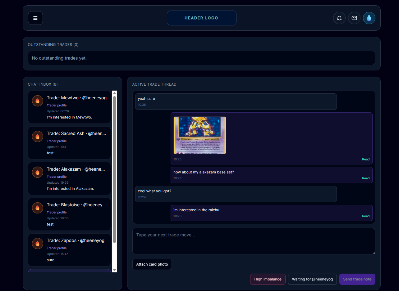
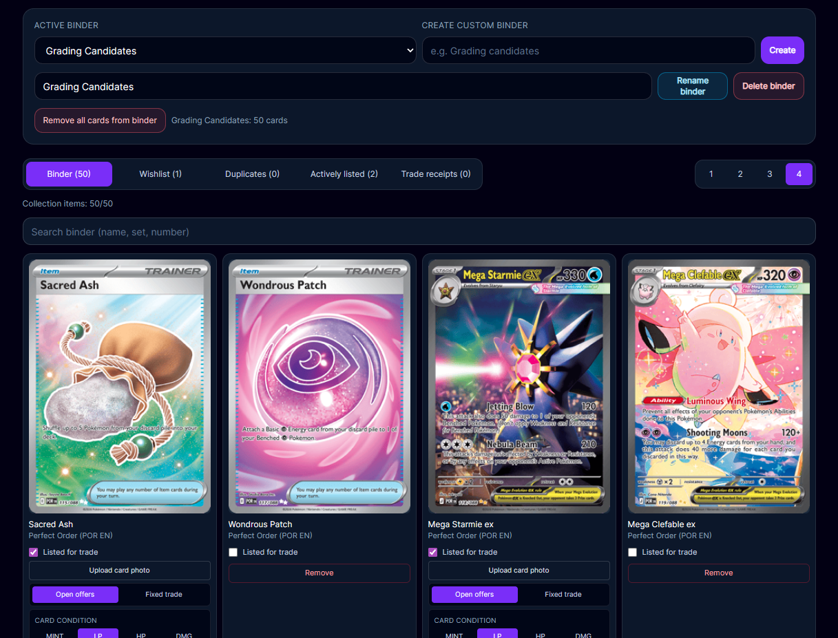
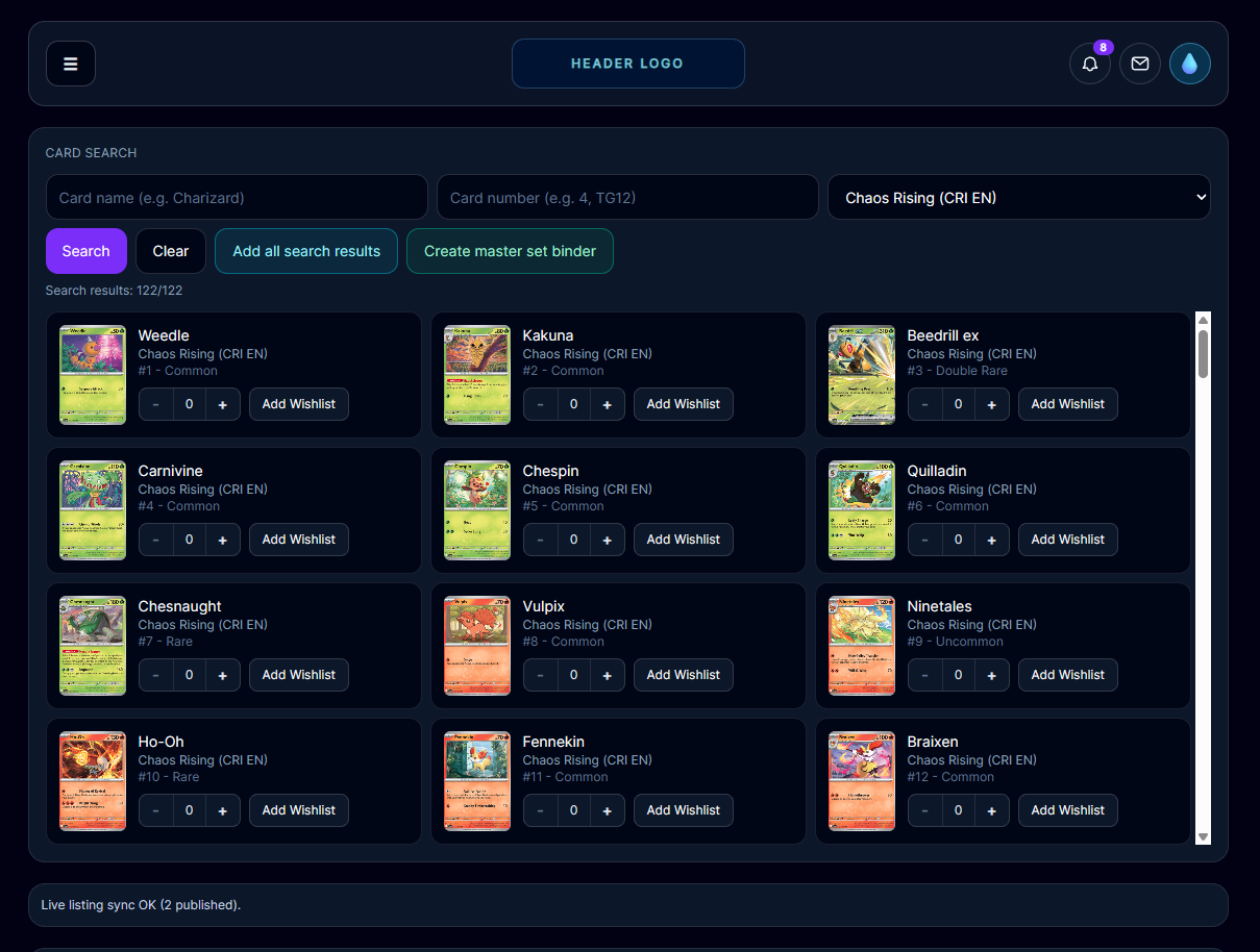
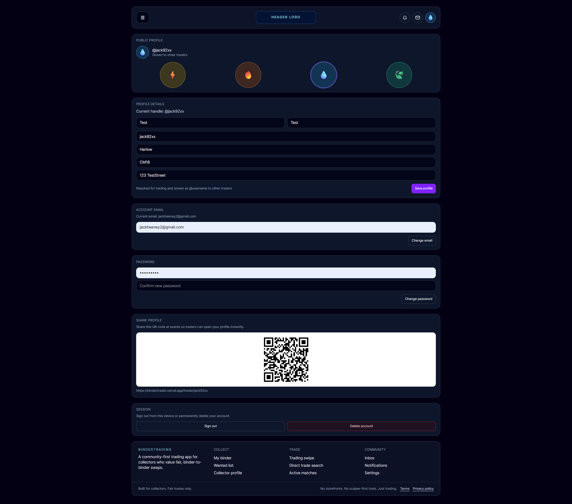
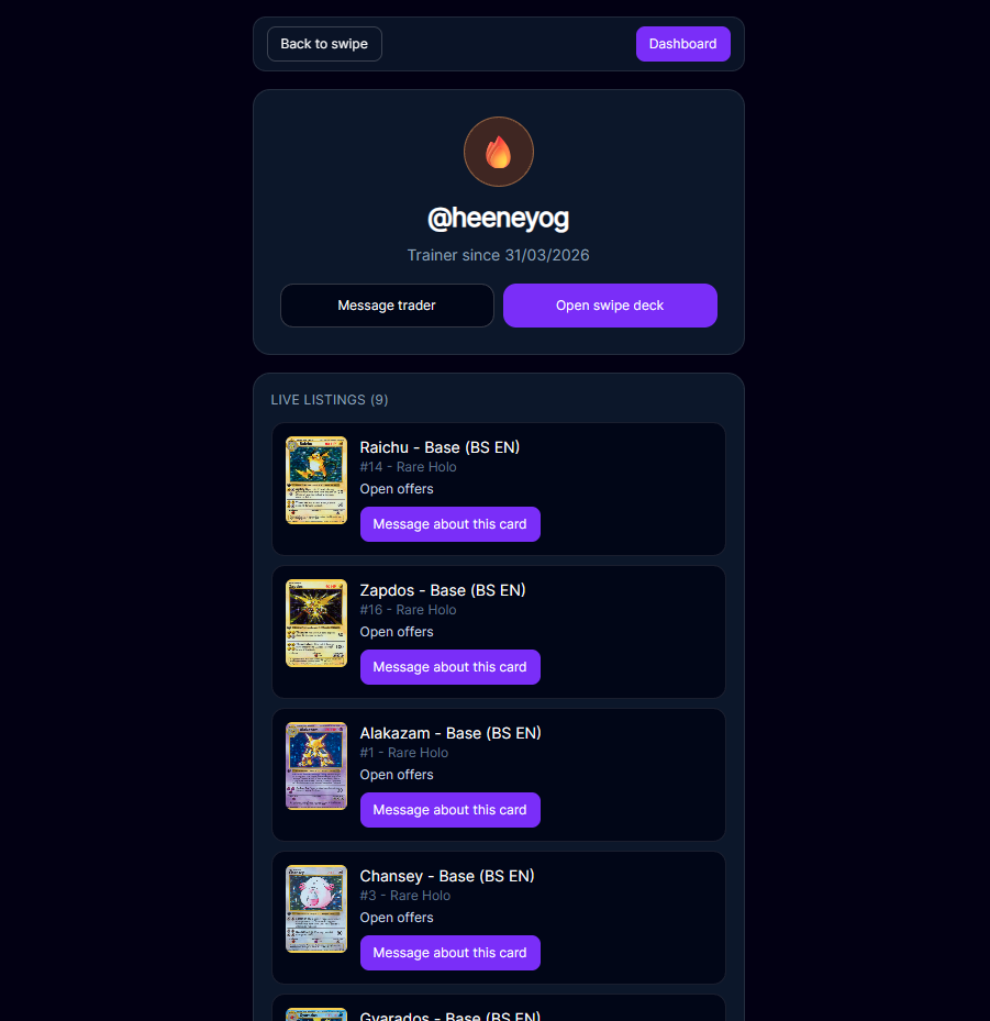
Trade-first card platform with scalable backend and transparent trade lifecycle UX.
STAR: Windows-style desktop portfolio with guided tours, STAR case studies, and live site previews.
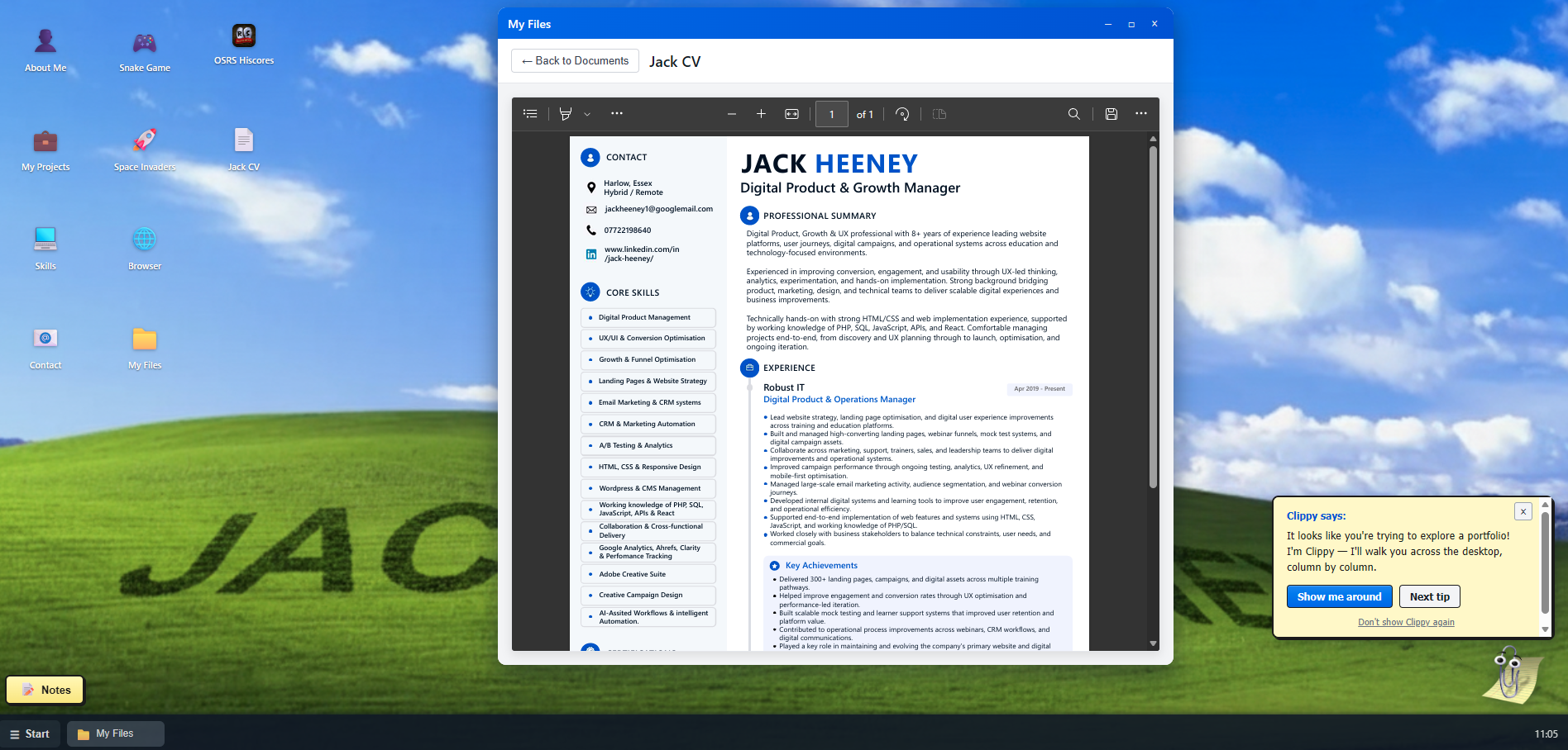
Jack CV.pdf
dissonance-moodboard-direction-branding.pdf
owner-handover-presentation.pdf
I design, build and scale digital products that improve customer experience, solve business problems and drive measurable growth.
I'm a Digital Content Strategy, Product & Growth professional with 8+ years' experience leading digital content, customer journeys and product experiences within technology-focused businesses. Throughout my career I've taken ownership of the strategy, development and continuous optimisation of websites, learning platforms, marketing content and digital products, ensuring every initiative supports measurable business objectives.
I specialise in building content ecosystems that improve discoverability, engagement and conversion across the entire customer journey. Combining UX research, analytics, SEO, AI Optimisation (AIO), experimentation and user behaviour insights, I've delivered content strategies that improve search visibility, increase customer engagement and drive commercial growth.
Working across Product, Marketing, Sales, Learning & Development, Technical Support and leadership teams, I've aligned digital content with wider business priorities, reduced duplication, improved consistency and helped deliver scalable customer experiences. I'm comfortable coordinating stakeholders with different priorities and translating business goals into practical digital solutions.
Alongside strategy, I'm a hands-on technical practitioner with experience using HTML, CSS, JavaScript, PHP, SQL, React and APIs. This enables me to move seamlessly between strategic planning and implementation, whether launching new digital products, optimising conversion funnels, developing internal systems or improving digital experiences through continuous iteration.
My approach is highly data-driven. I use analytics, user research and performance insights to identify opportunities, measure impact and continually refine content and product performance. I enjoy solving complex business problems, simplifying customer journeys and building digital experiences that create measurable commercial value.
Outside work, I enjoy strength training, hiking, mountain climbing and badminton. After nearly ten years playing rugby, I've developed a collaborative, resilient and continuously improving mindset that I bring to every project and team I work with.
Websites and landing pages I have worked on — open in the browser to explore:
Each write-up follows a Google-style STAR structure — Situation, Task, Action, and Result — with measurable impact, stakeholder context, and key learnings where relevant.
Decision-support UX across Cloud, Cyber, Data and AI pathways to reduce ambiguity and improve enquiry quality.
Behavioural analytics across email, landing pages, webinars and CRM to improve segmentation and funnel visibility.
STAR: streamlined operations during restructuring while preserving revenue-critical digital work.
Modernised the mock exam, results and revision journey to help students progress with clearer feedback and less manual support.
Responsive course and subscription website connecting learners with training, practice exams and a dedicated student portal.
Produced conversion-focused social assets across webinar, paid, and organic campaign streams.
Redesigned an existing nursery website around clearer parent journeys and built a secure admin portal for fast, independent content updates.
Designed and built an owned storefront for a friend's established Etsy shop, creating a path to Stripe checkout and lower marketplace fees.
Created a complete visual identity system for a drum and bass podcast concept with scalable social applications.
STAR: designed the label logo and produced event advertising, posters, social graphics, and after-party films.
STAR: release artwork, event flyers, and connected Instagram carousel posts for label campaigns.
Designed a trade-first card platform with robust lifecycle logic, scalable backend systems, and trust-first UX.
STAR: built a Windows-style desktop portfolio with guided tours, STAR case studies, and live site previews.
Case Study 1
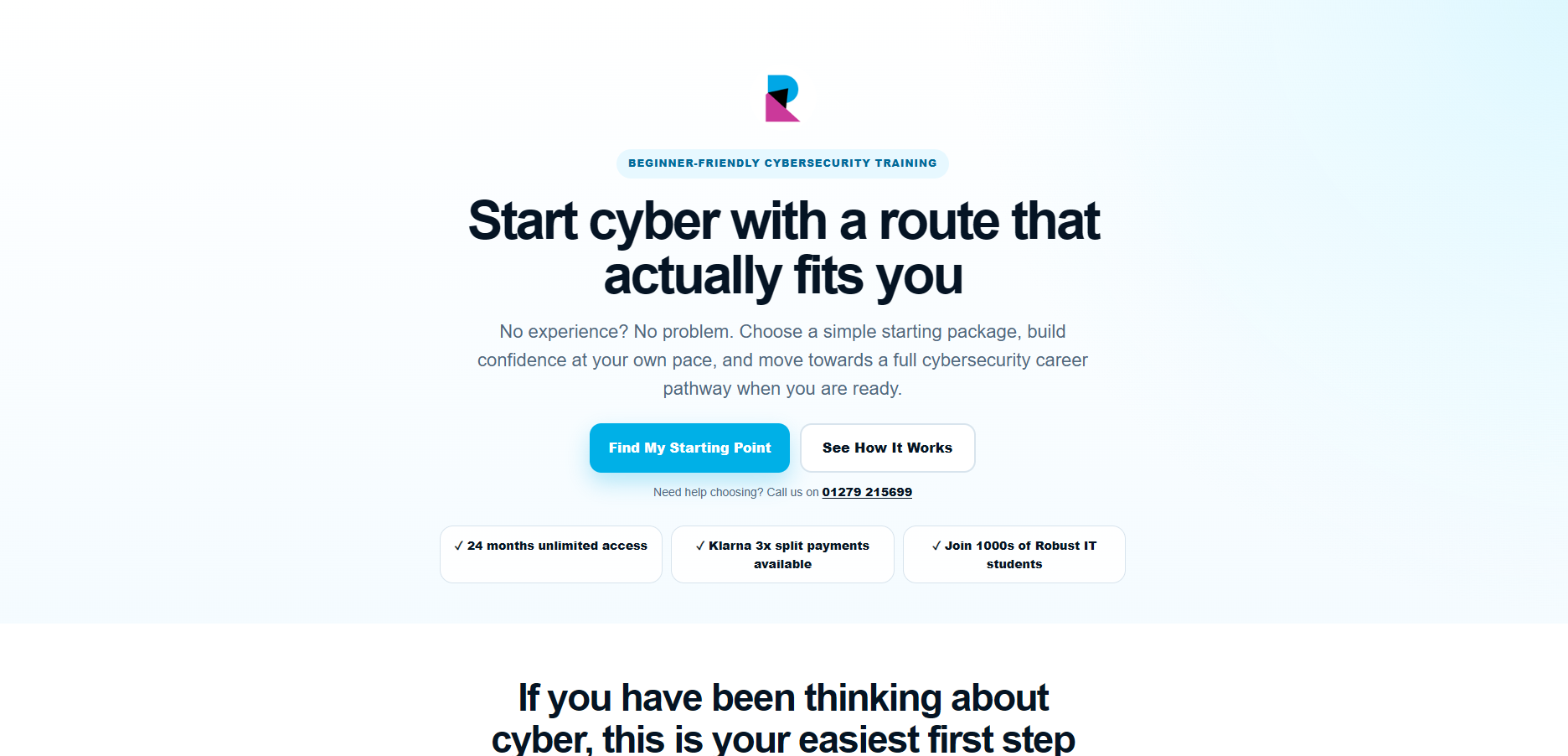
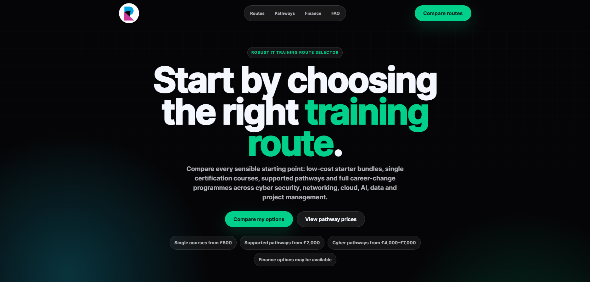
Improving the route-selection journey across Cloud, Cyber, Data and AI pathways by helping prospective students compare options, understand outcomes and enquire with more confidence.
I approached this project as a decision-support and conversion funnel challenge. Prospective students were interested in IT training, but many struggled to understand which pathway matched their goals. The aim was to reduce ambiguity, improve confidence and create a clearer journey from campaign click through to enquiry.
The existing journey introduced several training options but did not give users enough support when comparing Cloud, Cyber, Data and AI pathways. This created friction at a key decision point, where users needed reassurance, route clarity and outcome-focused guidance before making an enquiry.
Needed a simple way to compare routes, understand career outcomes and choose a starting point without feeling overwhelmed.
Needed enquiries from users who had already started thinking about their goals and preferred training route.
Needed a landing journey that connected email, paid ads, route messaging and enquiry forms.
Needed a scalable funnel that could support multiple training pathways without creating disconnected landing pages.
Does the user understand what problem this page solves?
Can the user quickly see the main training routes available?
Can the user compare Cloud, Cyber, Data and AI in a simple way?
Does the enquiry give the team enough context to have a better conversation?
Is the user confident enough to take the next step?
Does the content help the user choose the best route?
I reviewed how users moved from campaign traffic into the training route page and identified that the biggest issue was not just visual design. It was decision confidence. Users needed clearer information architecture, stronger comparison content and more reassuring calls to action before they were ready to enquire.
Users needed to understand the difference between pathways quickly.
The page needed to reduce decision fatigue.
CTAs needed to feel helpful, not overly sales-led.
Campaign messaging and landing page content needed to feel connected.
The sales team benefited from users arriving with clearer route intent.
The funnel needed a reusable structure for future training campaigns.
Users were shown several IT training options but not enough guidance on how to choose between them.
The experience needed clearer differences between pathways, certifications, outcomes and career routes.
Users could enquire before fully understanding the best route, creating extra explanation work for the sales team.
Email, ads, landing pages and enquiry forms needed to feel like one joined-up journey.
I redesigned the route-selection experience around clarity, comparison and guided decision-making. The objective was not just to improve the layout, but to help users understand what each pathway meant and what action to take next.
Each route was reframed around learner goals, career outcomes and certification direction.
The page helped users compare routes side by side instead of forcing them to interpret separate course pages.
Calls to action were positioned around helping users choose a route, rather than immediately pushing a generic enquiry.
The journey connected ads, email campaigns, route selection, enquiry and sales follow-up into one clearer flow.
The redesigned experience created a clearer route decision platform that helped prospective students understand their options, compare pathways and enquire with more confidence.
Users had a simpler way to understand which pathway best matched their goals.
The sales team received enquiries from users with stronger route awareness and clearer intent.
The route page created a stronger bridge between paid ads, email campaigns and enquiry forms.
The structure could be reused across multiple campaigns and future training pathways.
The experience helped answer key questions earlier in the journey before users reached the enquiry stage.
GA4, GTM, MailerLite, Ahrefs, Hotjar, Microsoft Clarity, HTML, CSS, JavaScript, WordPress.
The biggest lesson was that conversion problems are often decision problems. Users did not just need a better-looking page — they needed clearer context, comparison and reassurance before taking action. Improving the journey meant aligning UX, content, campaign messaging and sales follow-up around the same user decision.
Select any screenshot to view it full size.
The previous page introduced the training offer, but the redesigned version focused more directly on helping users choose the right route.
Case Study 2
Improving how prospective learners moved from email engagement to webinar registration, attendance and sales follow-up.
I approached this project as a customer journey optimisation challenge rather than a standalone email marketing task. The goal was to understand how prospective learners moved from first campaign touchpoint through landing pages, webinar registration, attendance and CRM follow-up, then use that insight to improve segmentation, messaging and user experience across the funnel.
Campaign activity was generating engagement, but the full journey was difficult to understand. Email performance, webinar registration, attendance and CRM outcomes sat across separate tools, making it harder to see where users dropped off, which audiences were most engaged and which follow-up journeys were most relevant.
Was the message relevant to this audience?
Did the page answer the user's questions quickly?
Was the next step obvious and low friction?
Did the user receive useful information before attending?
Was the user supported with the right next step?
Could the team understand previous intent?
Was the lead source and journey visible?
Did the session build trust and explain the route clearly?
I reviewed campaign performance, landing page behaviour, UTM-tagged journeys, webinar registration data and available CRM information to understand where engagement was strong and where the journey became unclear.
Opens showed awareness, but not necessarily intent.
Clicks and CTOR were stronger indicators of message relevance.
Landing page behaviour helped expose friction, especially on mobile.
Webinar attendance created a stronger signal of buying intent.
CRM attribution was limited because email, webinar and sales data were not fully connected.
Large audiences could receive similar messages even when their interests, intent level or previous behaviour differed.
Users could engage with an email but fail to progress through the landing page or registration journey.
MailerLite, Zoom and CRM data were useful individually, but they did not provide a single end-to-end view of the customer journey.
Without clearer segmentation, follow-up communication risked being less relevant to where the user actually was in their decision-making process.
I grouped users based on engagement behaviour, campaign interaction and intent signals so future emails could be more relevant.
I adjusted email content and CTAs to focus on user questions, trust-building and clearer next steps rather than generic promotion.
I reviewed landing page behaviour and improved page structure, CTA placement, mobile usability and clarity around the webinar journey.
I used UTM-tagged links to understand which emails, CTAs and audience segments were driving visits and registrations.
I reviewed MailerLite, Zoom and CRM data to understand how users moved across the journey and where the business lacked a complete view.
The visuals below are self-made, anonymised summaries designed for portfolio presentation. They represent the types of behavioural and campaign signals I monitored without exposing internal reports or confidential data.
To make the metrics meaningful, I compared the anonymised campaign indicators against common email marketing benchmark ranges.
Sender reputation was protected
Openers were engaging with the content
List quality and relevance were maintained
Click rate needed to be interpreted by audience warmth and intent
Benchmarks are indicative and vary by industry, list quality, audience intent and campaign type.
The most important discovery was that the journey could not be fully understood from one system. Email engagement, webinar attendance, CRM activity and commercial outcomes existed across separate tools. This made it difficult to answer product and marketing questions such as which audience converted best, which webinar journeys created the strongest intent, and where follow-up should be prioritised.
The project improved the way campaign performance was understood. Instead of treating emails as isolated sends, the work reframed email activity as part of a wider product journey involving segmentation, behavioural signals, landing page UX, webinar attendance and CRM follow-up.
If continuing this project, I would prioritise a connected reporting layer that combines email engagement, webinar behaviour, CRM progression and revenue outcomes. This would make it easier to understand the complete customer journey and support better product, marketing and sales decisions.
Work Project
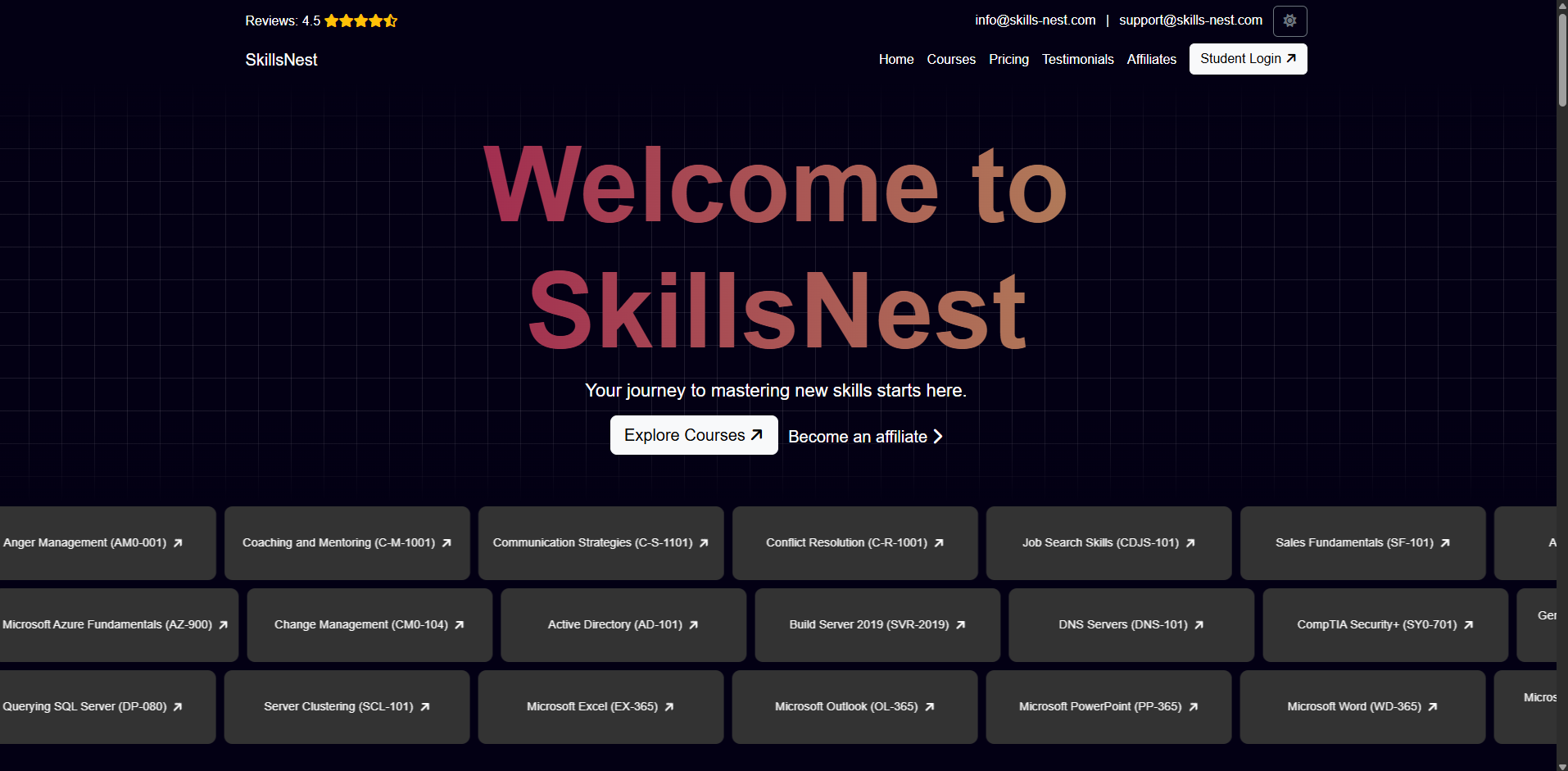
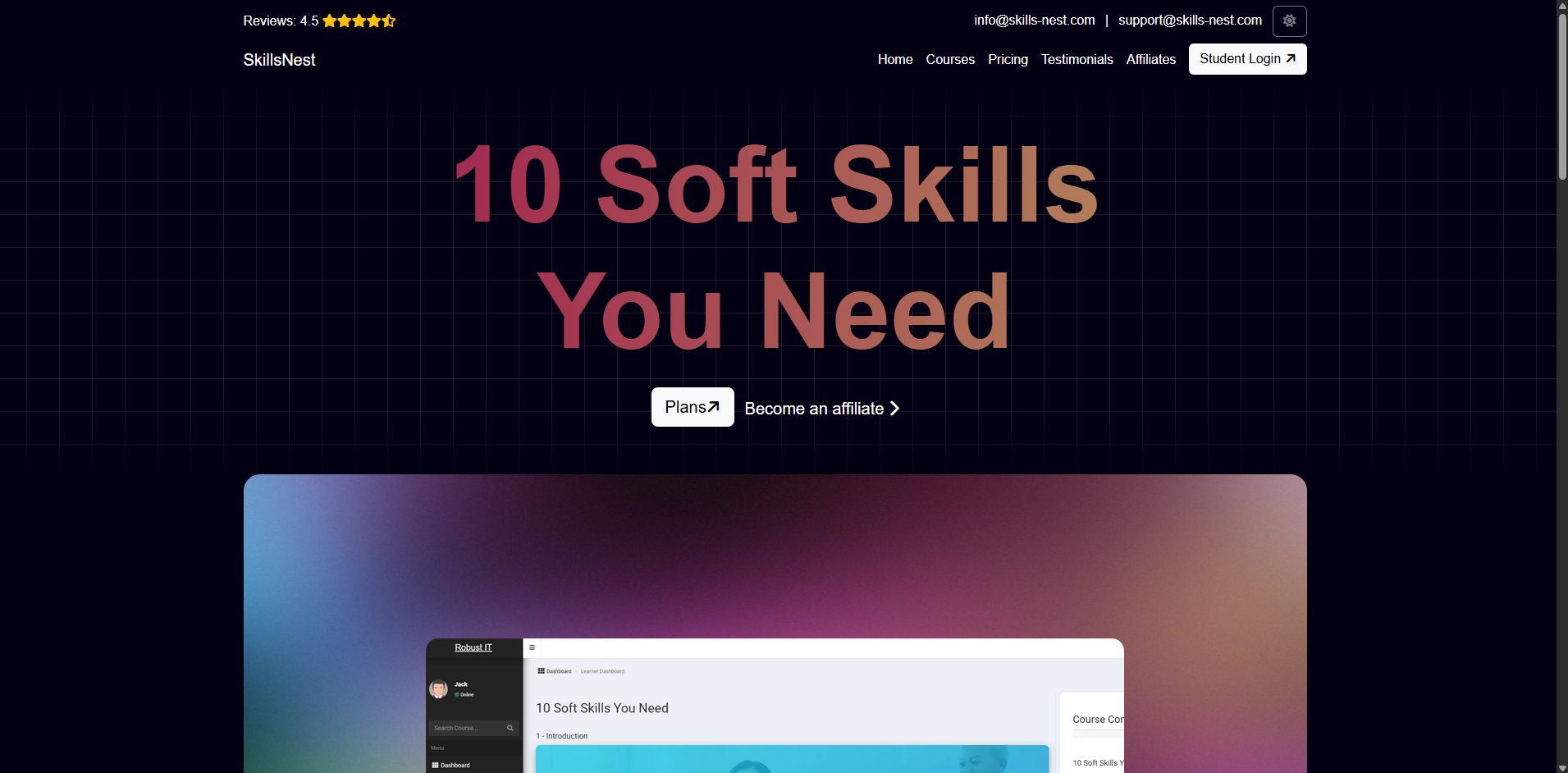
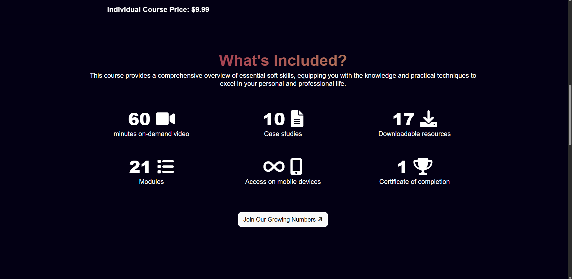
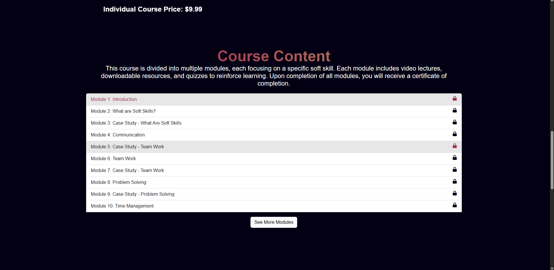
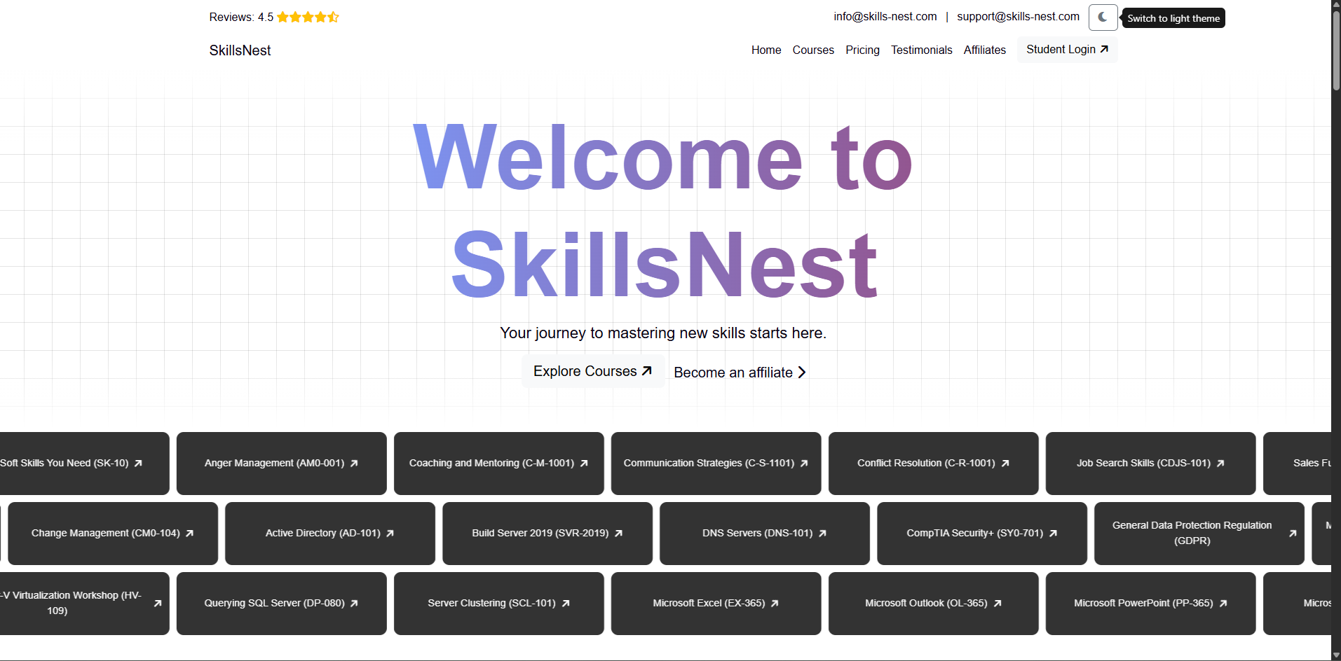
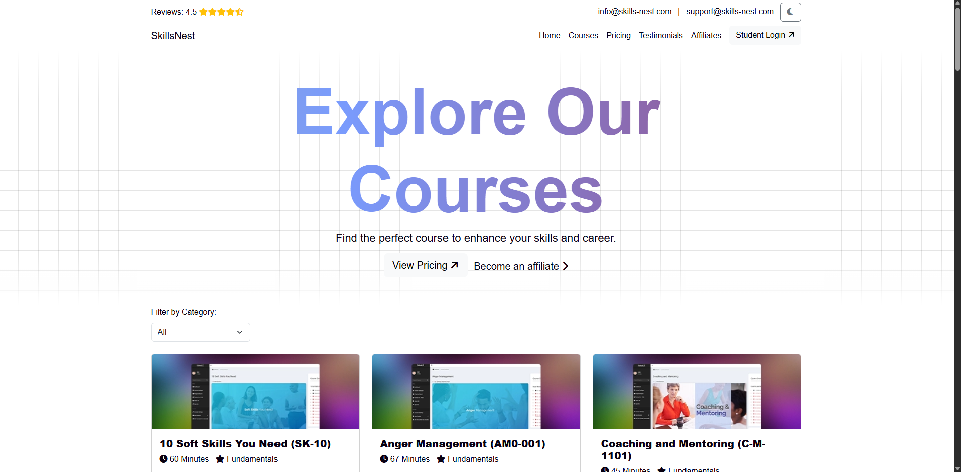
A responsive education-commerce experience that brings course discovery, certification practice, subscription pricing and student access into one clear journey.
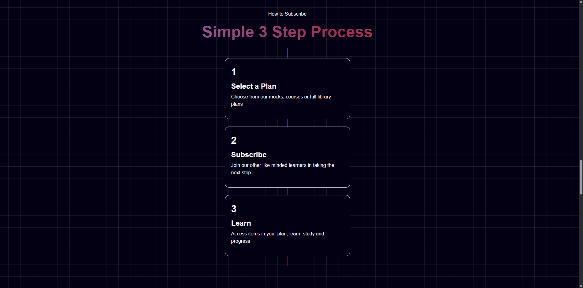
SkillsNest needed a public-facing home for a broad training catalogue spanning professional soft skills, IT courses and certification practice exams, with a clear route into its separate learning portal.
Create a coherent, responsive website that could communicate the breadth of the library, explain the subscription model, establish learner trust and guide visitors toward courses, pricing or student login.
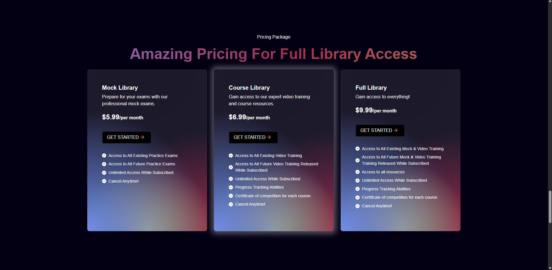
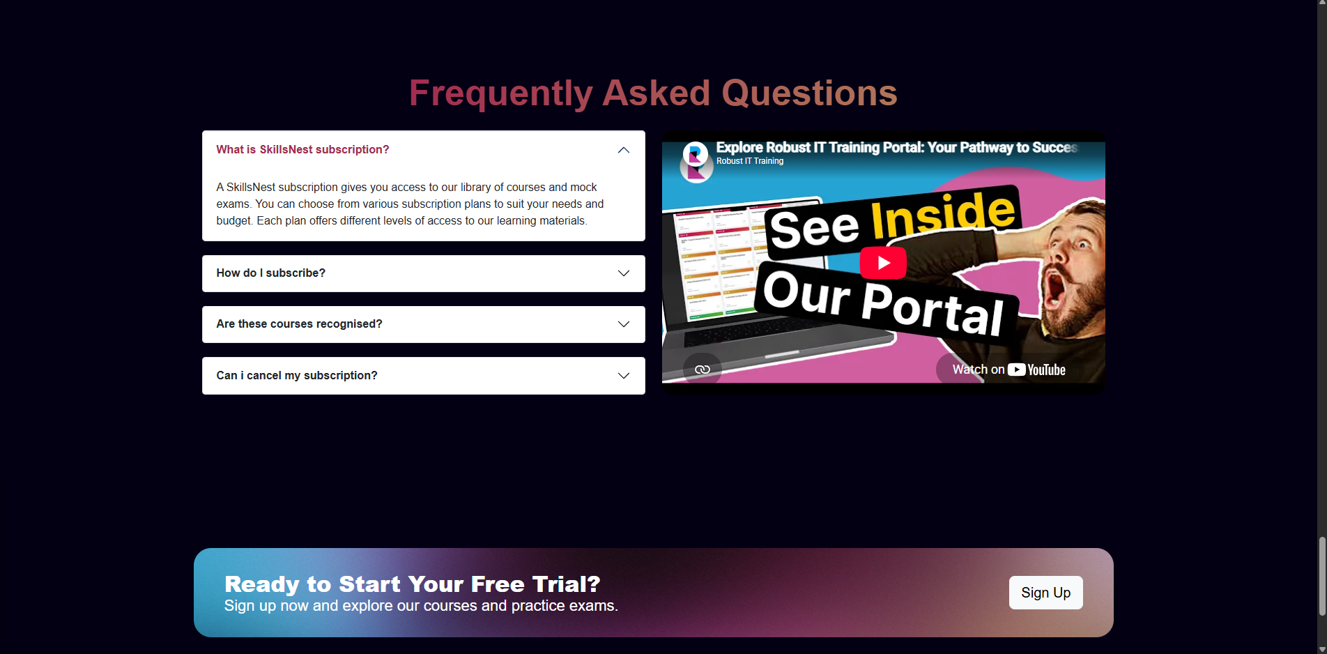
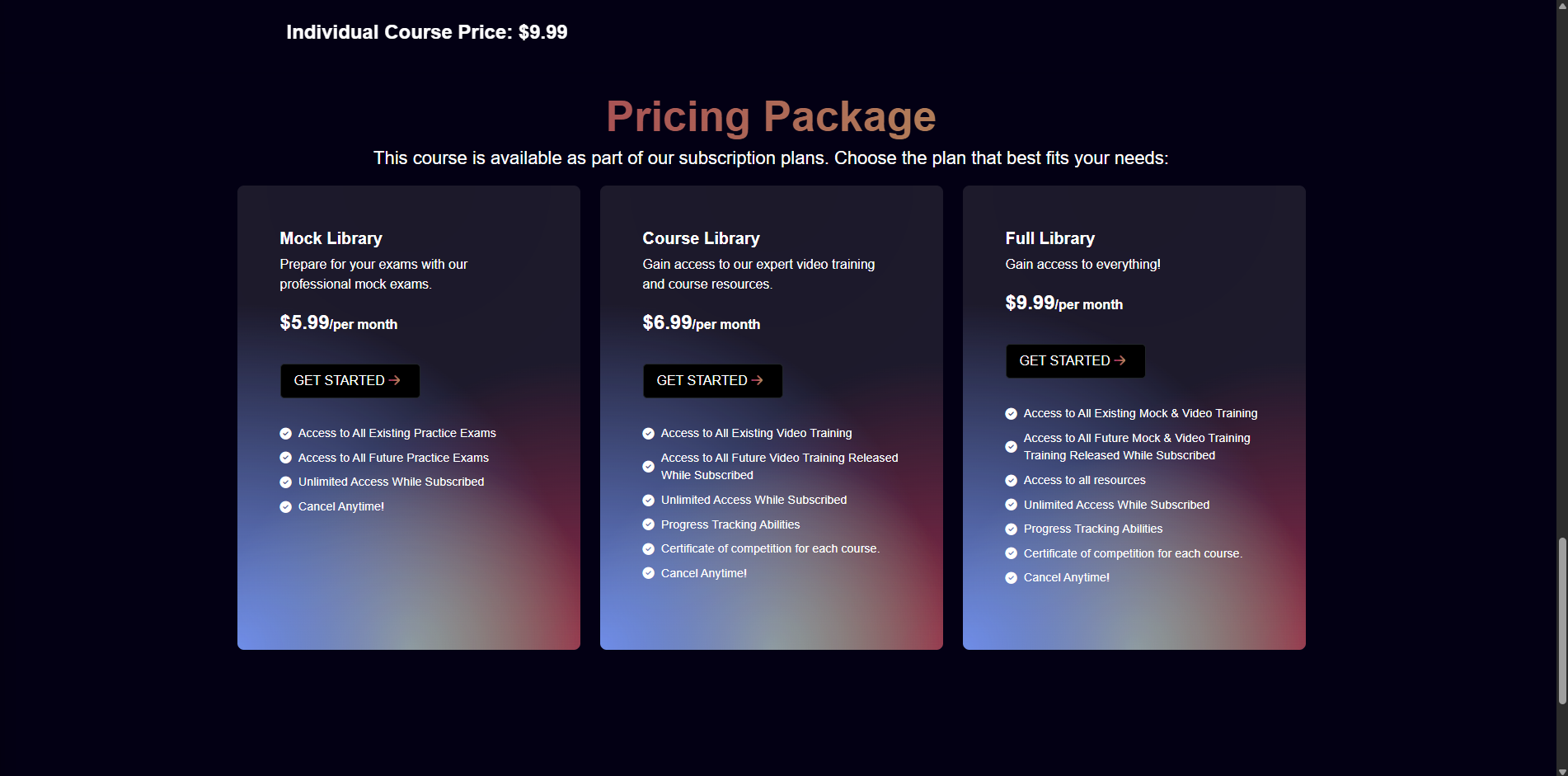
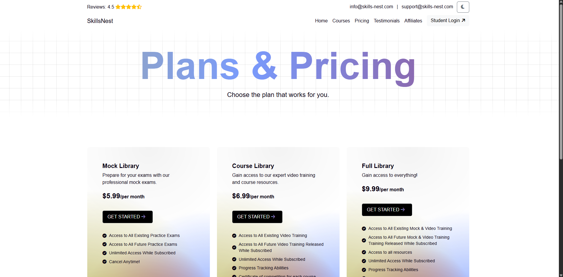
Designed a modular page system around oversized gradient typography, structured course cards, practice-exam features, learner testimonials, subscription steps, pricing comparisons and FAQs. Light and dark themes preserve the same visual language while supporting different viewing preferences.
Built connected homepage, catalogue, pricing and individual-course experiences, using reusable content patterns and prominent calls to action to keep course exploration and subscription decisions easy to follow.
Delivered a live, content-rich learning website that presents courses and practice exams in a consistent brand system, makes plan differences easy to compare and connects prospective and existing students to the right next step.
A large learning catalogue needs more than strong visuals: visitors need repeated orientation points that clarify what is available, how access works and whether an individual course or library subscription is the right next step.
Select any screenshot to view it full size.
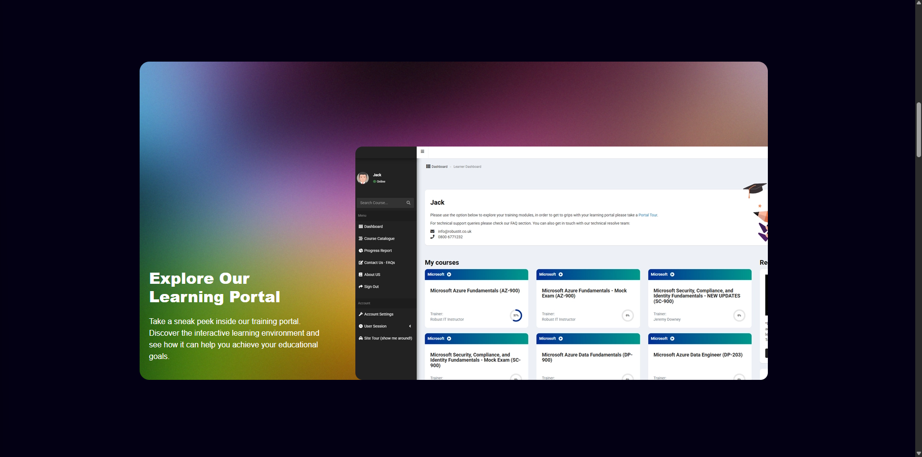
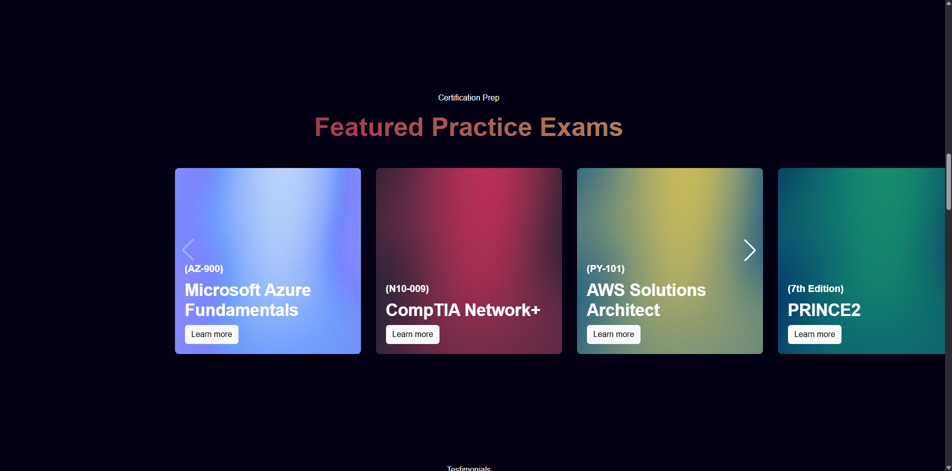
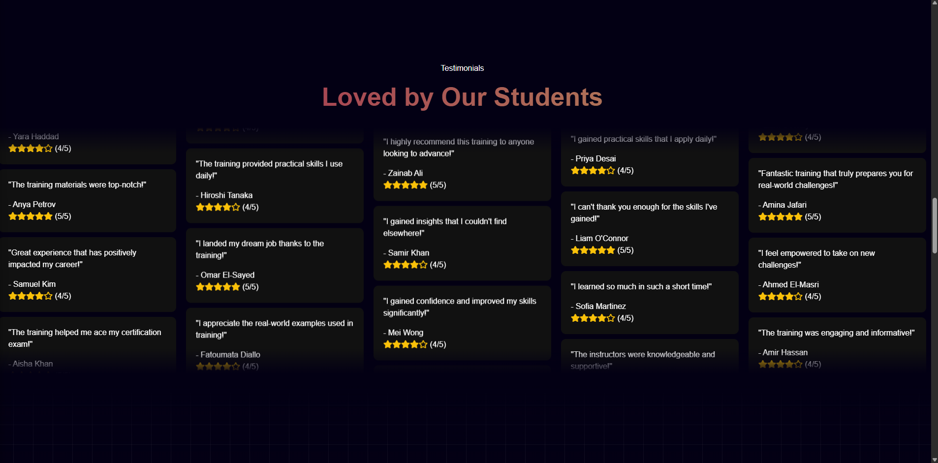
Friends & Side Project
A complete redesign of an existing nursery website, pairing a professional, child-friendly public experience with a secure content platform the nursery team can update themselves.
The nursery's existing website made important information difficult for parents to find, and its forms were causing problems. Routine updates also depended on another person, so publishing time-sensitive information could be slow.
Redesign the full public experience to feel professional, clean, child-friendly and visibly high quality, while giving the nursery team direct control over the information families rely on.
I rebuilt the information architecture around the questions and actions parents need most: learning and care, fees, menus, nursery guidance, visits and applications. I created clear desktop and mobile navigation, focused calls to action and purpose-built contact and application forms.
I also designed and developed a secure admin portal where authorised staff can publish alerts, maintain the rotating food menu, write formatted news posts and knowledge-base guides, upload accessible gallery images, schedule content and manage publishing workflows.
Delivered a responsive, high-quality digital presence that makes nursery information easier to discover and gives staff a much faster route from an operational update to published parent-facing content. The same system now connects alerts, menus, news, guides and gallery content across the admin and public website.
Next.js, React, TypeScript, Supabase, PostgreSQL, secure authentication, role-based content management, rich-text editing, responsive UX, accessible form design, image management, SEO and Vercel.
A successful redesign has to improve the organisation behind the website as well as the pages visitors see. Giving staff safe, structured publishing tools means clearer information for parents and less delay whenever the nursery needs to communicate.
Select any screenshot to view it full size.


The original homepage used a narrow, visually busy layout with fragmented content and competing navigation. The rebuild creates a clearer hierarchy around the information and actions parents need most.


Case Study 9
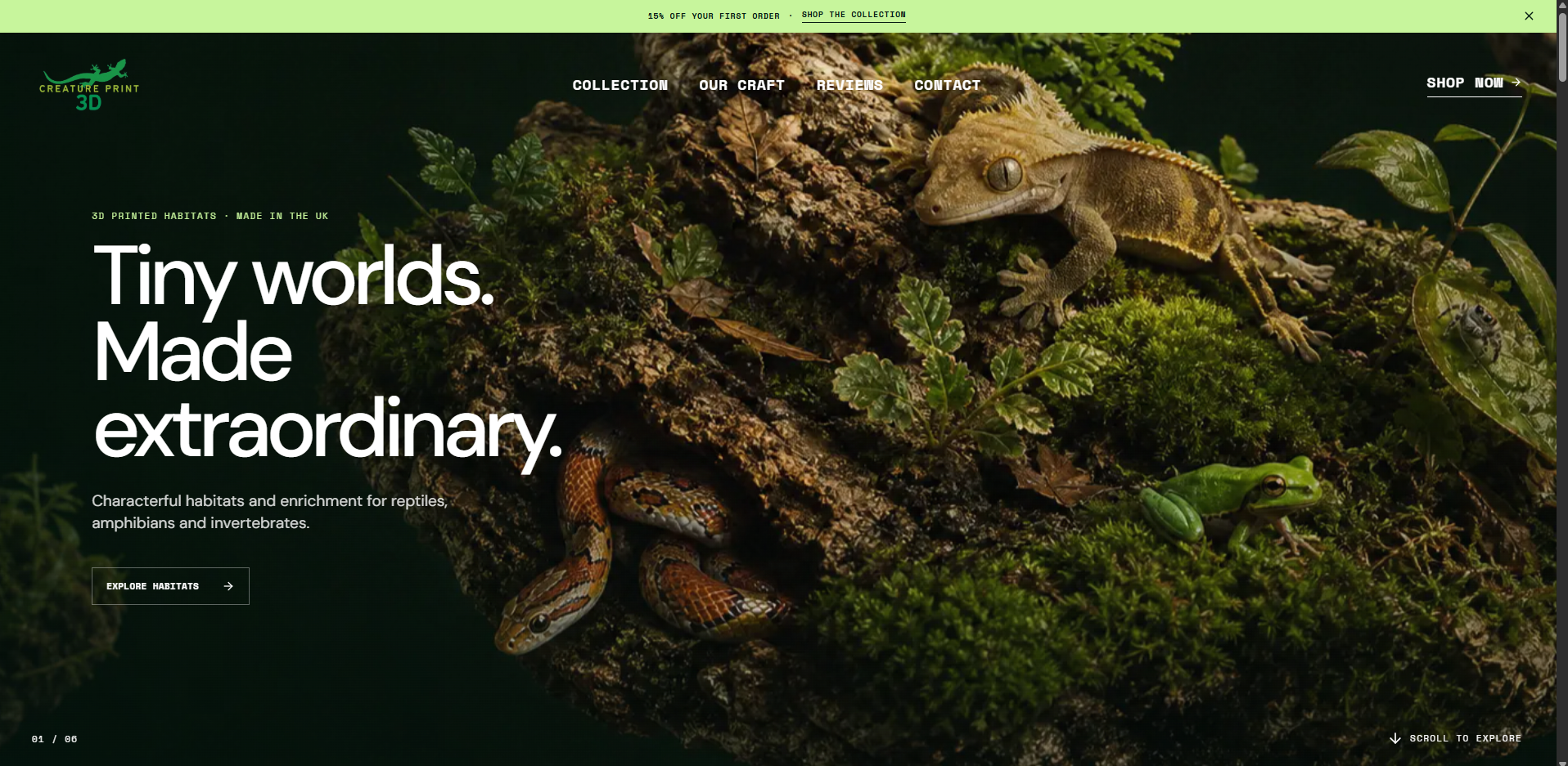
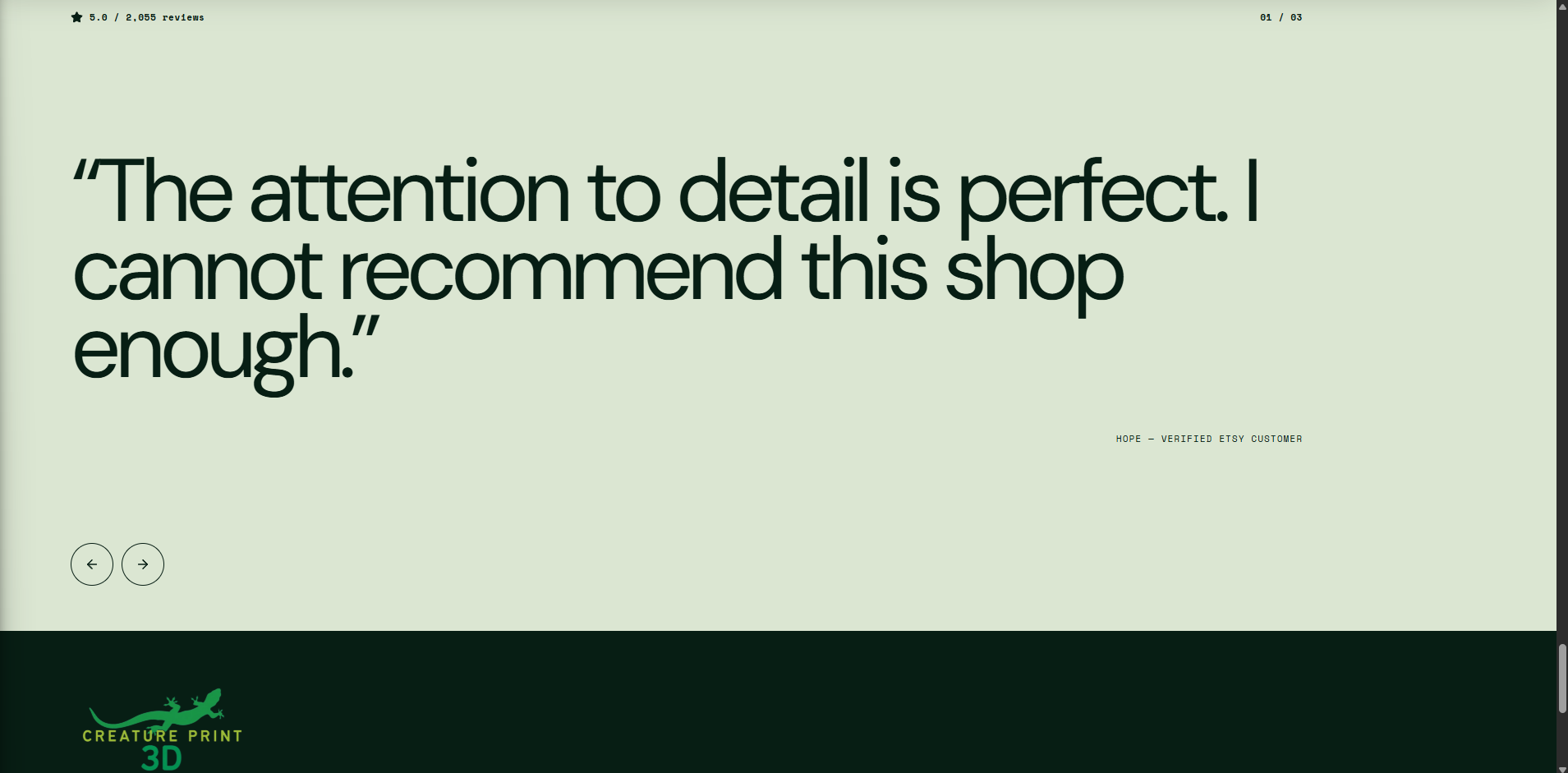
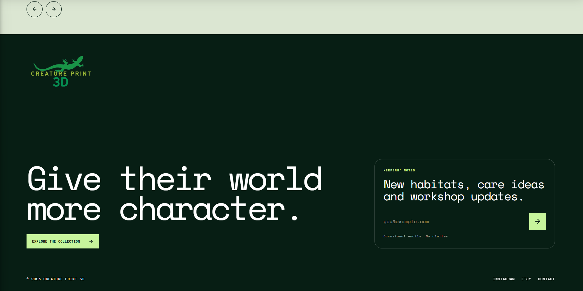
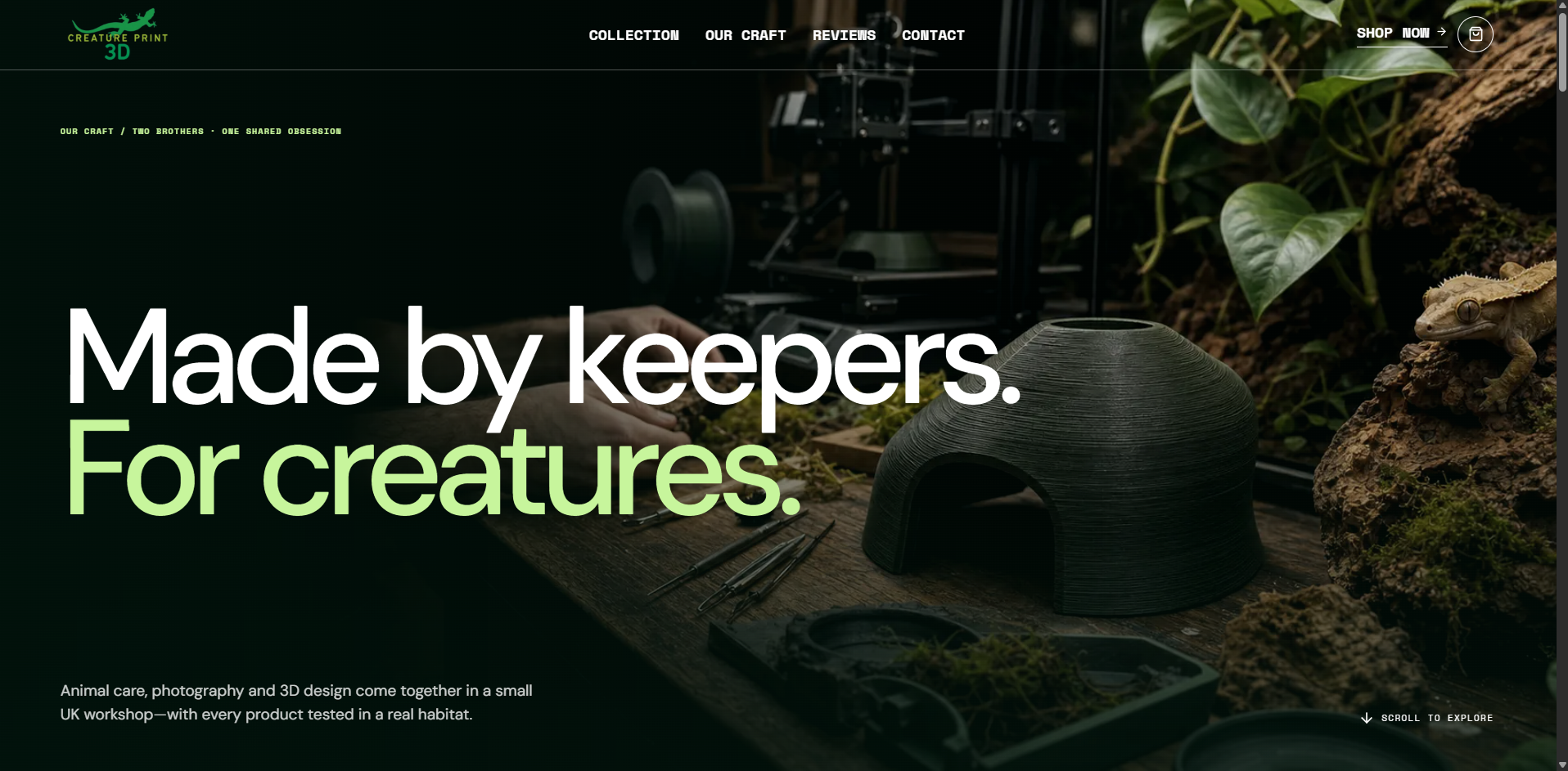
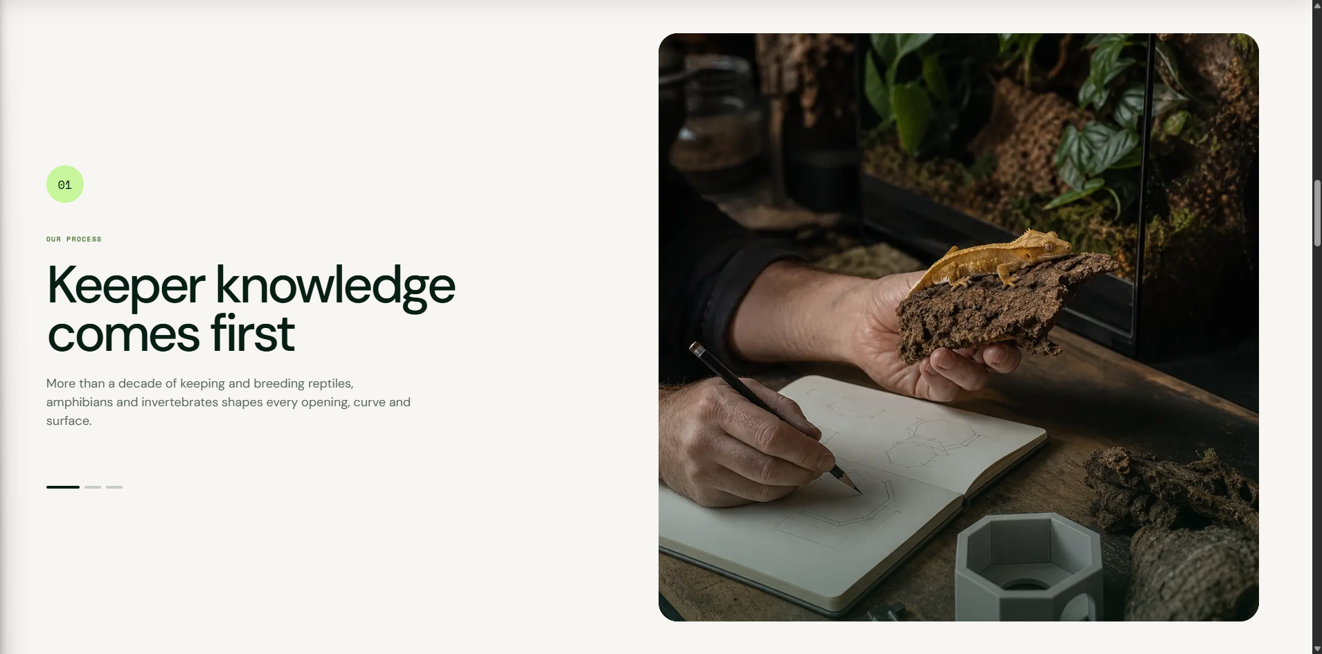
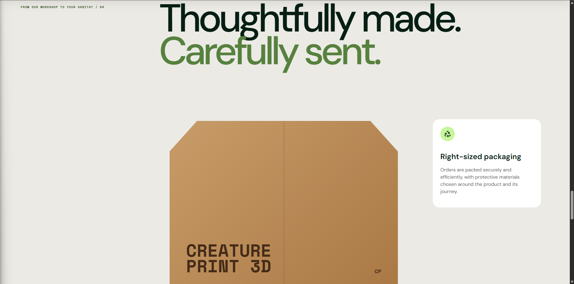
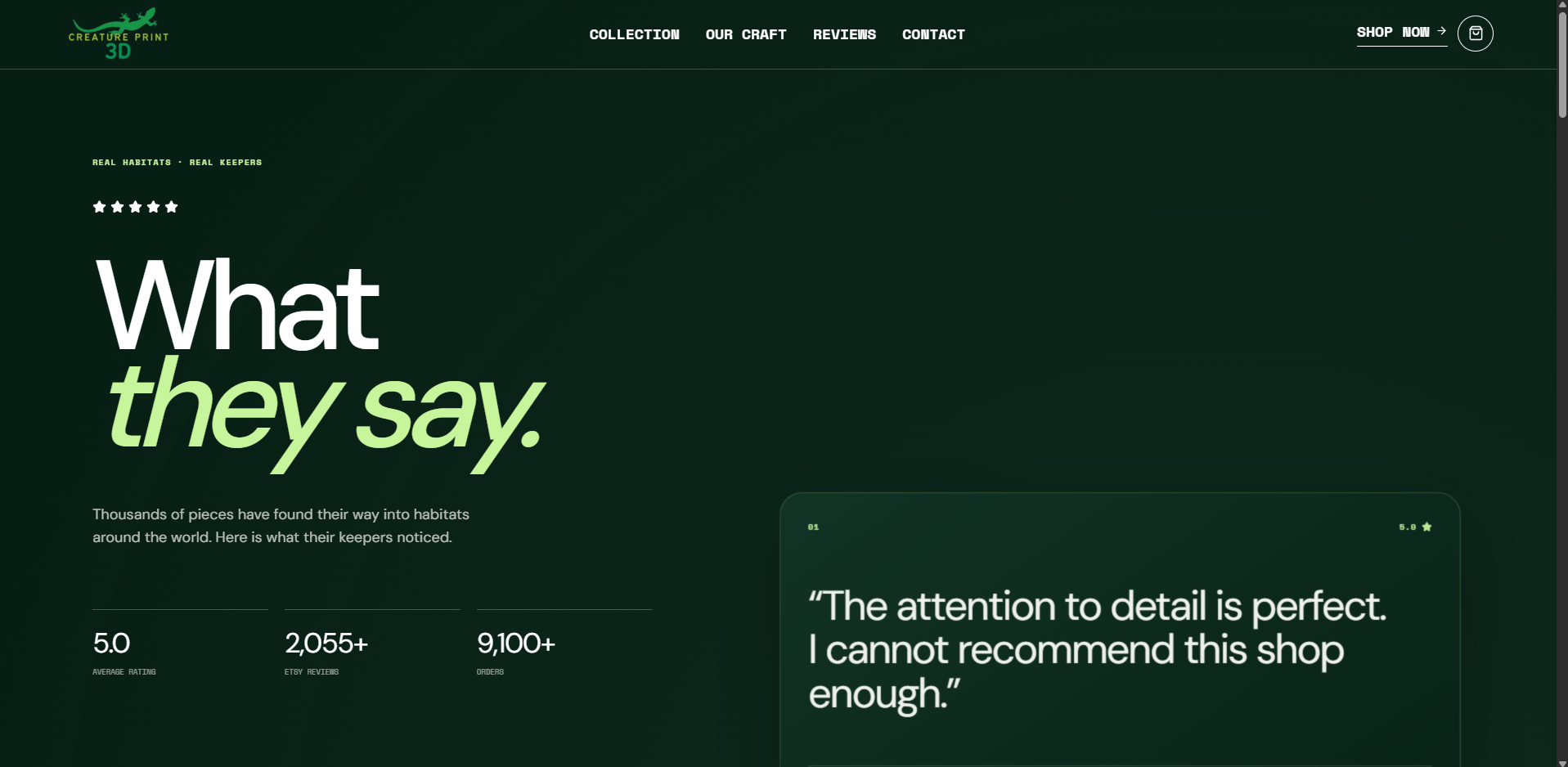
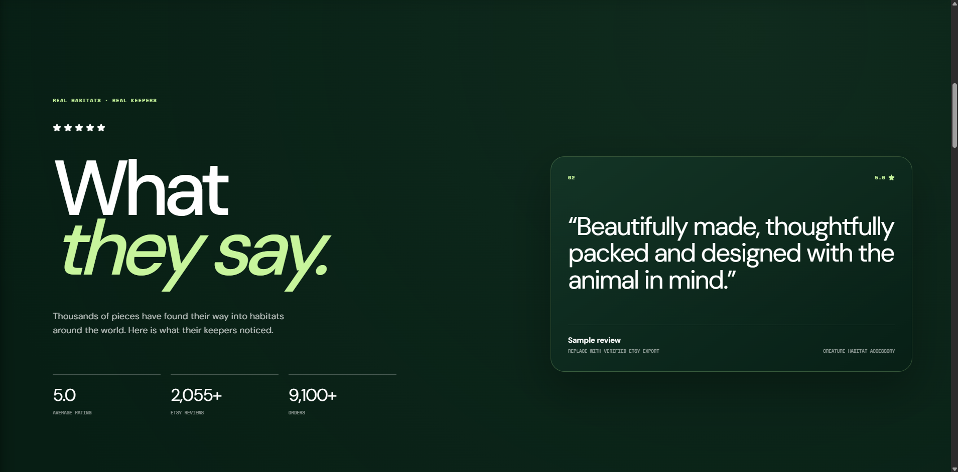
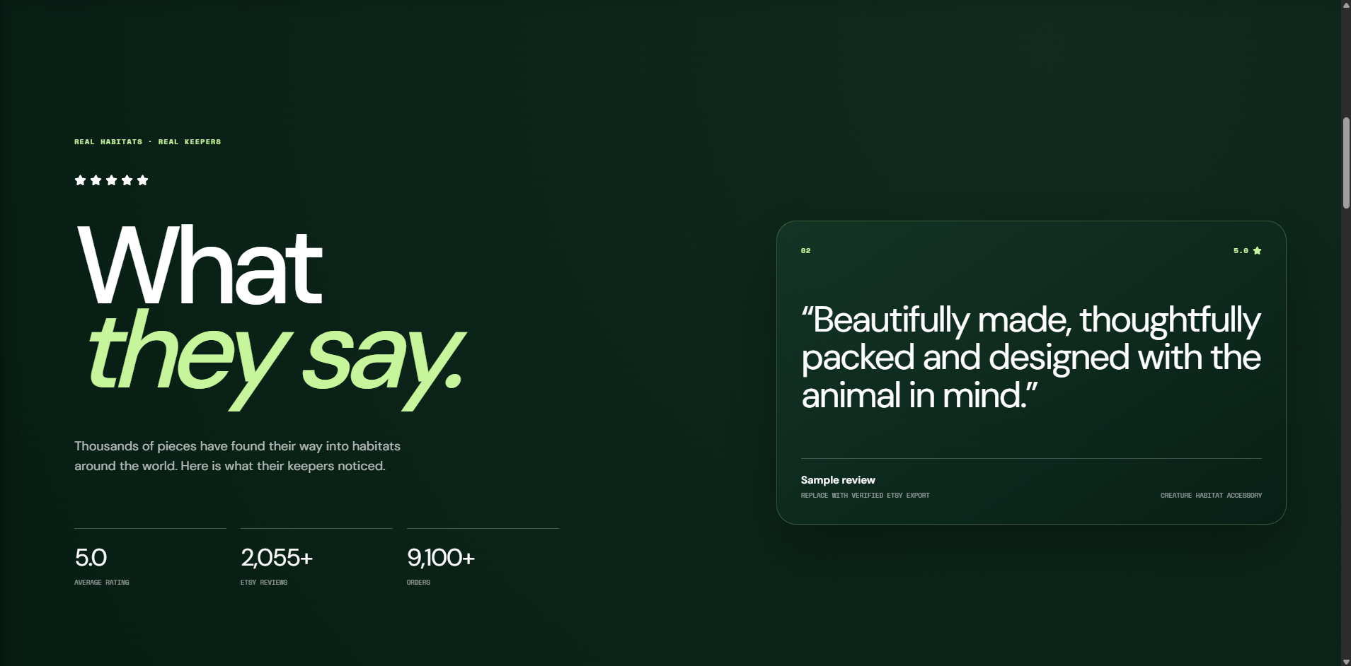
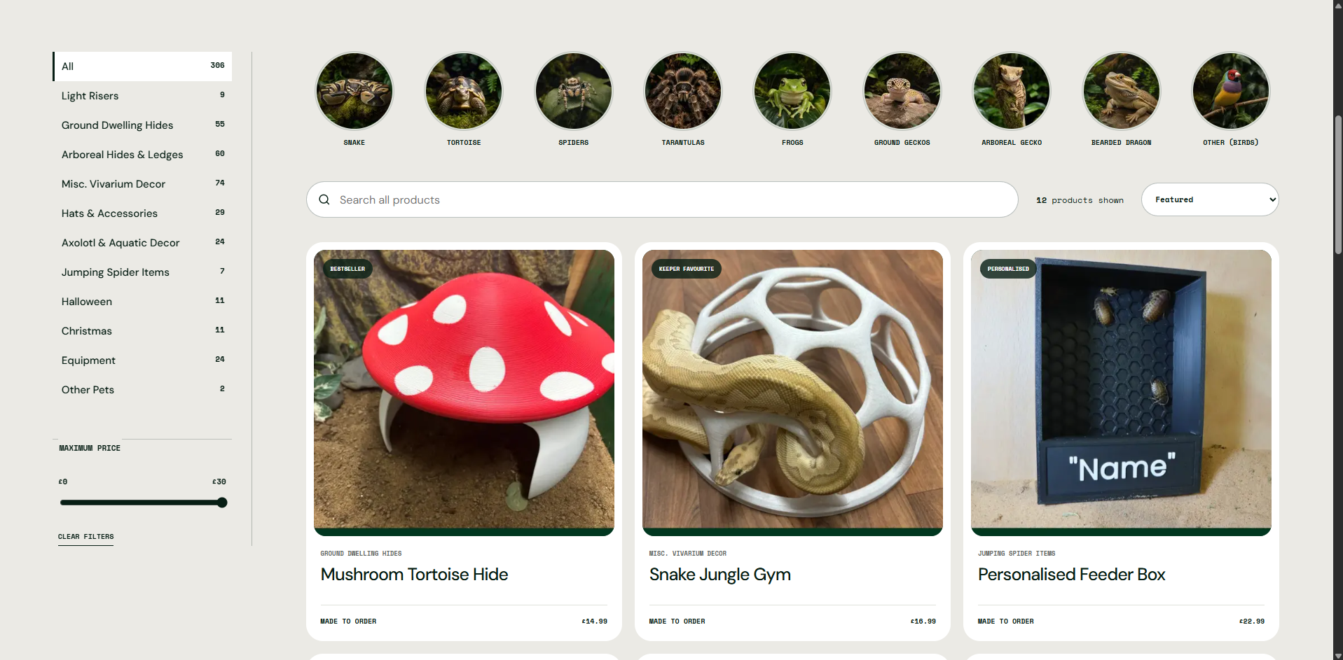
Designed and built an immersive, independent e-commerce experience for a friend's established Etsy store, giving the business a path toward an owned Stripe storefront with lower marketplace fees.
A friend's Creature Print 3D business had built an audience and strong review history on Etsy, but marketplace fees and platform dependence limited how much control the store had over its customer experience and future growth.
As a side project, I set out to turn the store's reptile-keeping expertise and 3D-printed products into a distinctive owned website that could support direct Stripe payments without losing the trust, product discovery, or personality established on Etsy.
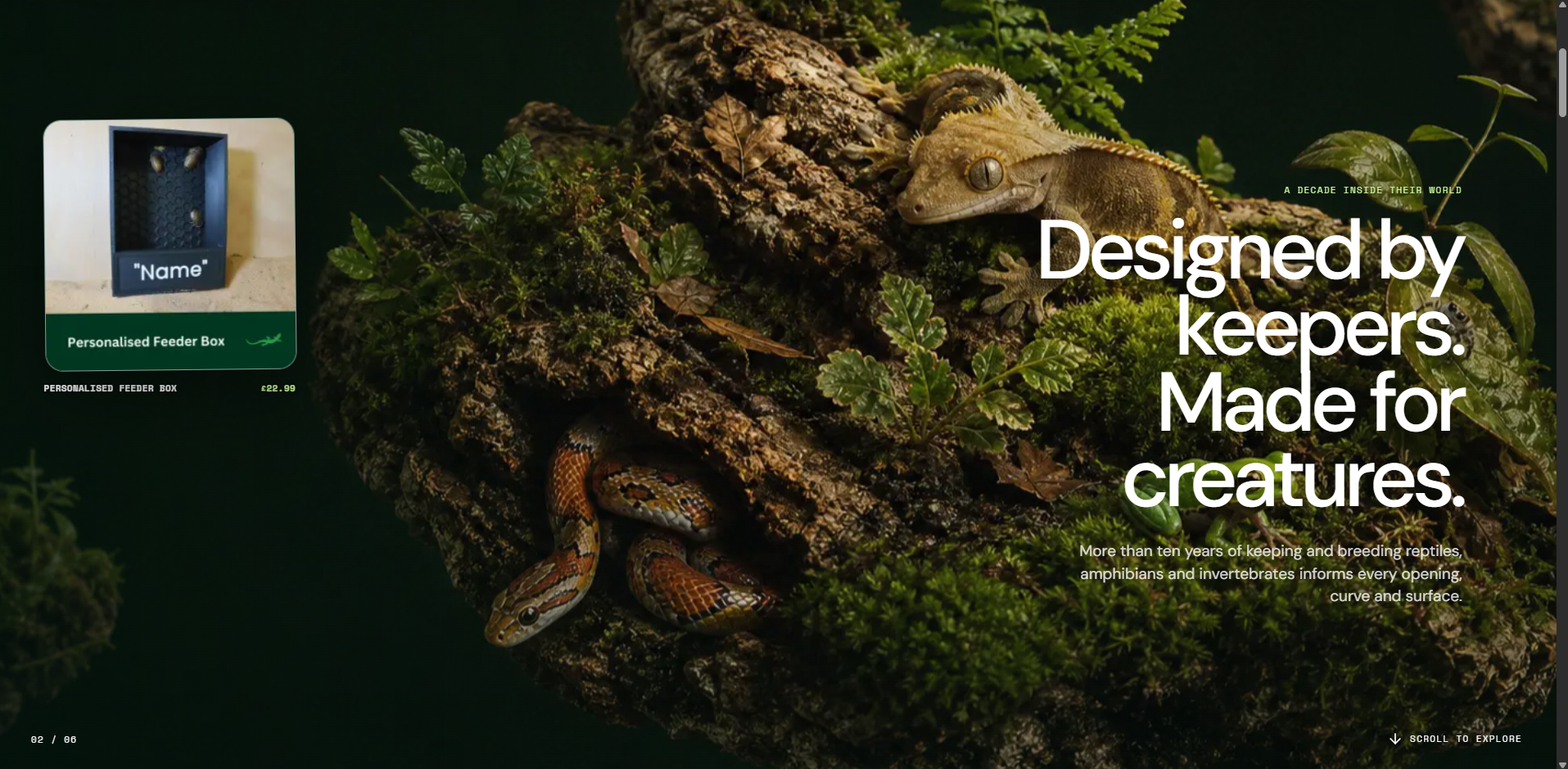
I designed a highly visual brand experience around real habitats, keeper knowledge, and product-in-use photography. The site combines cinematic storytelling, responsive product discovery, category and animal filters, customer proof, and detailed craft messaging.
I built the storefront as a modern responsive web app, created reusable product and navigation patterns, and developed the Stripe-ready commerce flow so the business can move toward direct ownership of checkout and customer relationships.
Delivered a polished live storefront that gives Creature Print 3D an independent home beyond Etsy, communicates the specialist value behind the products, and establishes the foundation for direct Stripe sales with fewer marketplace costs.
Next.js, React, TypeScript, responsive CSS, Stripe Checkout, product catalogue architecture, Vercel, UX design, visual direction, and e-commerce content strategy.
Moving a marketplace business toward its own storefront is not just a checkout migration. The independent site has to replace Etsy's built-in discovery and trust signals with stronger product storytelling, proof, navigation, and brand confidence.
Select any screenshot to view it full size.
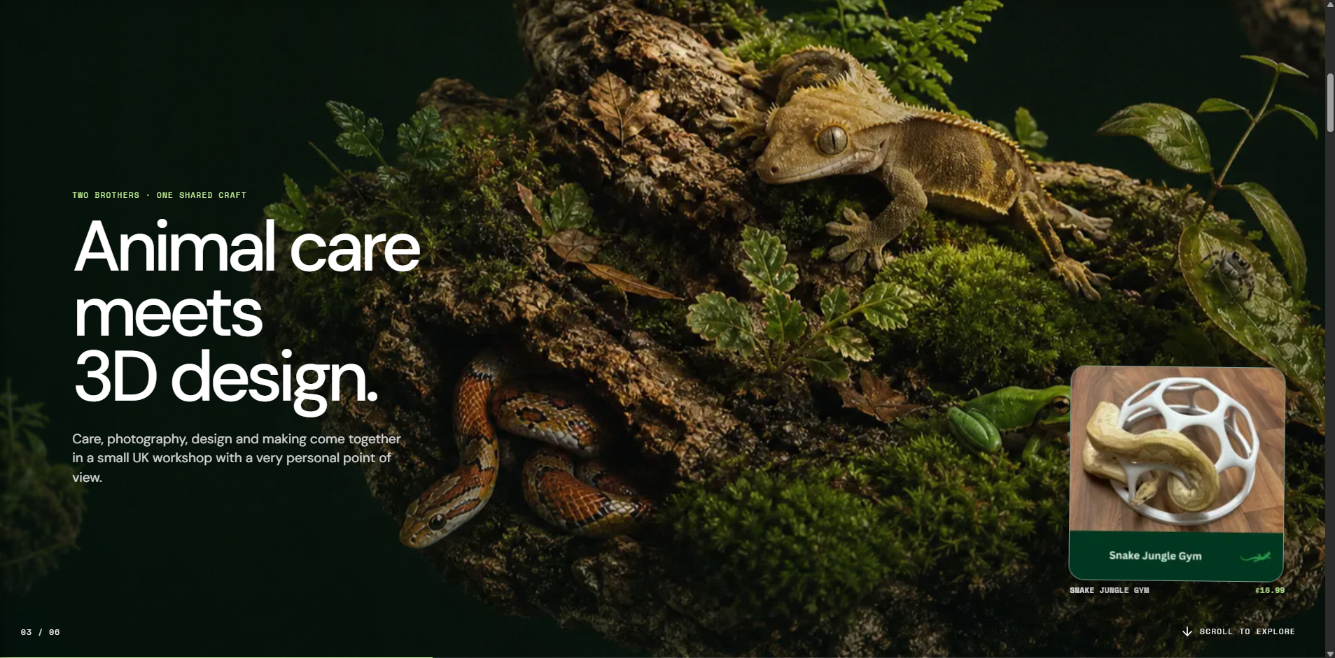
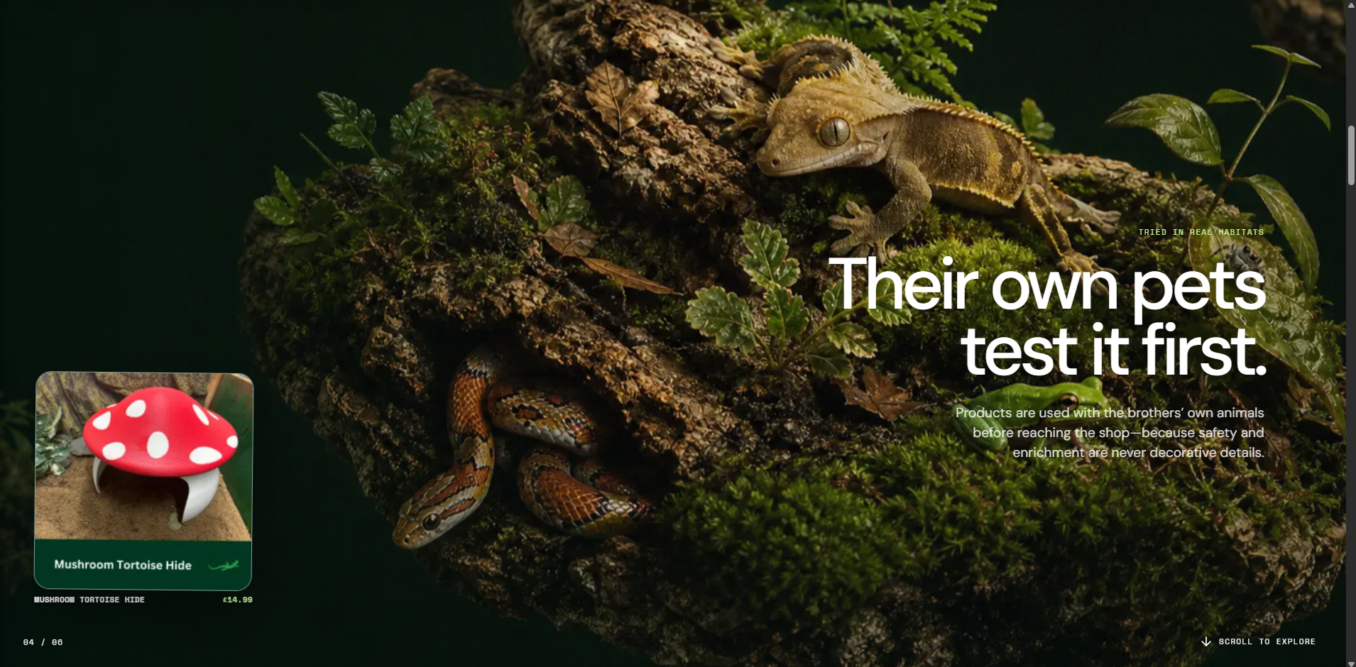
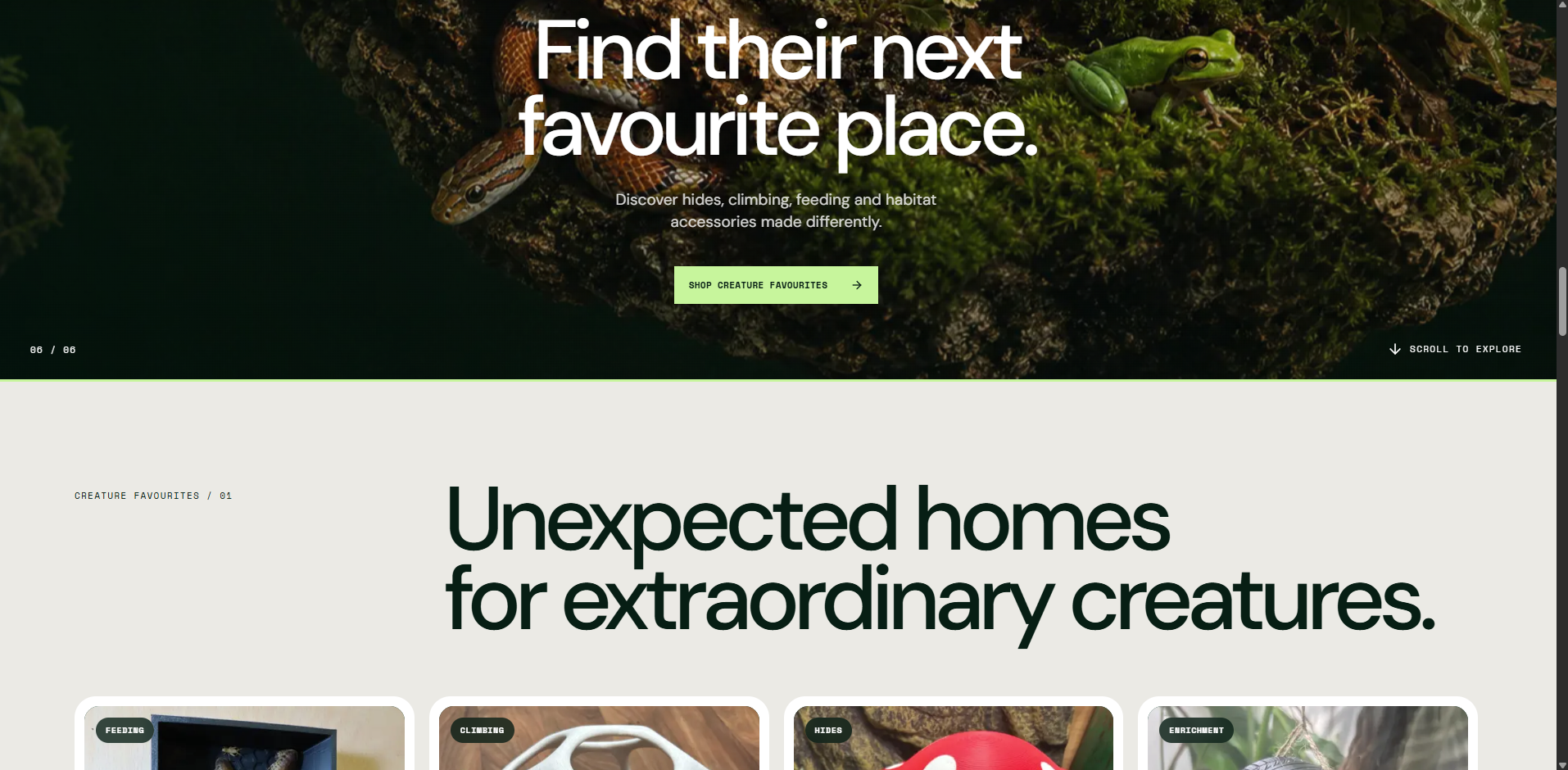
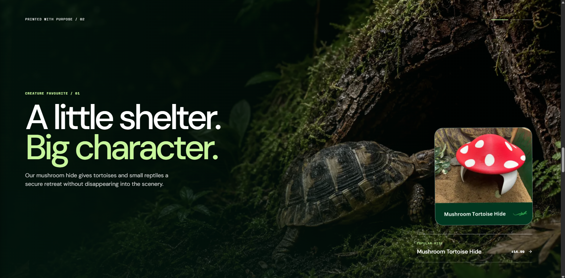
Case Study 10
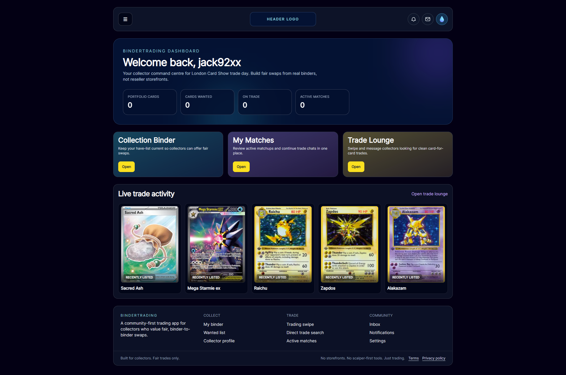
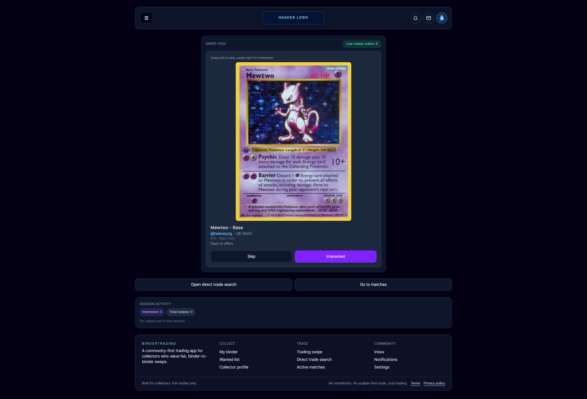
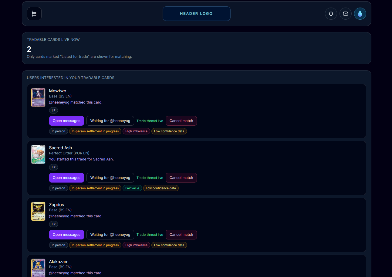
Designed and built a trade-first platform concept for transparent, community-driven card exchanges.
Most existing card platforms prioritised sales over trading, while reliable inventory sync and transparent settlement states remained difficult to achieve at scale.
As founder and lead developer, I was responsible for product architecture, trust-centric UX, database design, backend trade logic, and production deployment.
I migrated from Supabase to a PostgreSQL and Prisma stack with Docker and Next.js, then personally implemented lifecycle, ownership, settlement, and notification systems with race-condition handling.
I designed trade-matching flows, in-app messaging, binder collections, and profile systems so users could follow trade status end to end without ambiguity.
Established a scalable, production-ready platform foundation, reduced sync and persistence issues from the earlier architecture, and improved user trust through clearer trade status and confirmations.
Next.js, React, TypeScript, PostgreSQL, Prisma ORM, Docker, Vercel, Auth.js, HTML, CSS, JavaScript.
Trust in marketplaces is a product problem as much as a technical one — explicit state transitions and reliable data ownership matter more than feature breadth early on.
Select any screenshot to view it full size.
Case Study 3
Mapping cross-department workflows to separate routine operational overhead from specialist digital work linked to marketing, CRM, UX, automation and revenue-supporting systems.
I approached this project as a product operations and systems-mapping challenge. During a period of business restructuring, the key issue was not simply reducing workload — it was understanding which activities were routine overhead, which were specialist digital capabilities, and which systems directly supported lead generation, customer experience and operational continuity.
The business needed clearer visibility of where time and effort were being spent across website updates, CRM activity, email campaigns, webinar support, reporting, automation, admin and support requests. Without a structured view of these responsibilities, it was difficult to make confident decisions about what could be automated, outsourced, reduced or retained internally.
Needed a clearer view of which activities created operational value, supported revenue or created avoidable overhead.
Needed continued support for campaigns, landing pages, email production, analytics and optimisation.
Needed clearer boundaries between student/admin support tasks and specialist digital/product responsibilities.
Needed marketing and CRM systems to keep supporting lead generation, follow-up visibility and conversion activity.
Needed a practical way to decide what should be retained, automated, outsourced or deprioritised.
I reviewed recurring activities across departments and grouped them by business value, complexity, repeatability and dependency risk. The aim was to make invisible work visible, so decisions could be based on operational impact rather than assumptions.
Some tasks were routine and repeatable enough to automate or outsource.
Some responsibilities required specialist knowledge of website, CRM, UX or campaign systems.
Several workflows crossed departments and lacked a single clear owner.
Reporting needed to combine multiple systems rather than relying on isolated metrics.
High-impact digital work risked being undervalued when grouped with general admin.
Better categorisation made prioritisation easier during resource constraints.
Many recurring responsibilities were happening in the background, making it difficult for stakeholders to understand the full workload.
Website development, CRM management, email systems, analytics and automation could be misunderstood as simple support tasks rather than specialist digital capabilities.
Without a shared framework, urgent low-value requests could compete with higher-impact work linked to campaigns, conversion and customer experience.
Performance visibility depended on combining website analytics, email reporting, CRM activity, heatmaps and campaign data.
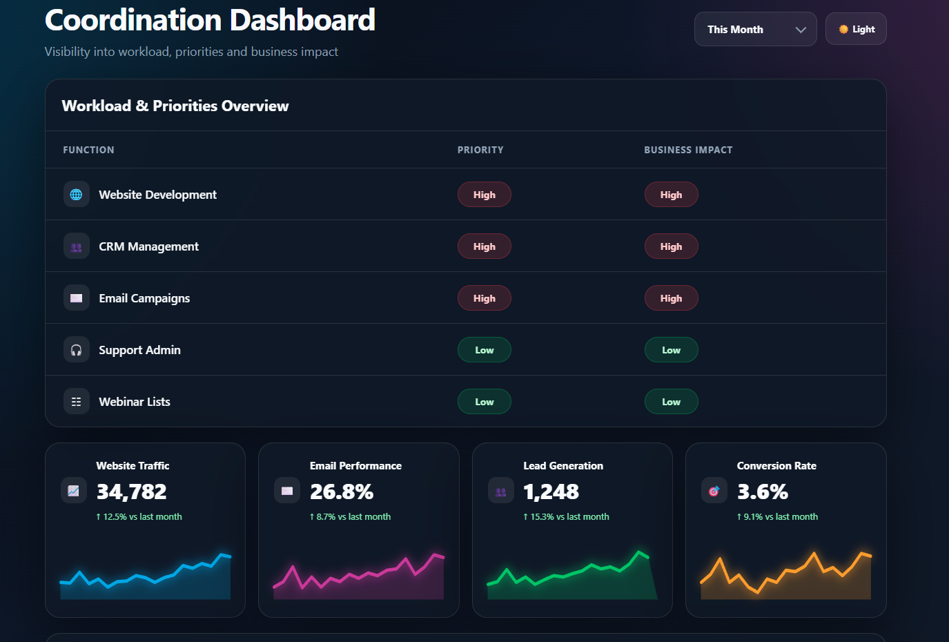
I created a clearer operating model by separating task types and identifying where specialist digital capabilities should be protected, where routine activity could be simplified, and where reporting could support better decision-making.
Grouped work into admin, support, marketing, CRM, website, automation, reporting and product-related activity.
Distinguished technical and growth-related work from routine operational tasks.
Protected activity connected to lead generation, CRM visibility, website performance, campaign production and customer experience.
Highlighted repeatable processes that could be simplified, outsourced or automated.
Connected analytics, email, CRM and campaign data so stakeholders could see performance more clearly.
The output was a clearer cross-department operating view that helped separate low-value operational overhead from specialist digital activity. This created a stronger foundation for resource planning, workload prioritisation and business continuity.
Made recurring responsibilities easier to understand, group and prioritise.
Created a clearer distinction between routine tasks and specialist digital capability.
Helped protect website, CRM, marketing and automation work during operational change.
Improved the way stakeholders could view campaign, website and CRM performance.
Created a repeatable approach for reviewing future responsibilities and workflow changes.
I worked across multiple digital systems to connect operational activity with performance visibility and day-to-day delivery.
The biggest lesson was that operational clarity is a product problem as much as a management problem. When responsibilities are not clearly mapped, specialist work can be undervalued and high-impact systems can be treated as routine admin. A simple workflow model helped make hidden dependencies visible and supported better decision-making.
The dashboard concept brought workload priorities, business impact ratings and performance visibility into one place. The aim was to help stakeholders understand which systems supported lead generation, campaign performance and customer experience.
Select the screenshot to view it full size.
Case Study 4
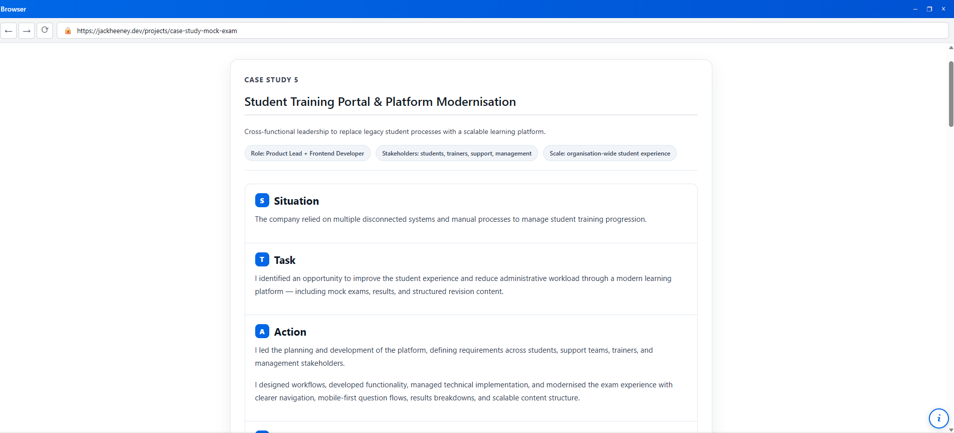
Redesigning the mock exam, revision and results experience to help students progress through training with clearer feedback, better navigation and less dependency on manual support.
I approached this project as a student journey and platform modernisation challenge. The goal was to improve how learners moved through training, practice exams, revision, feedback and next-step guidance, while also reducing the operational burden on support teams, trainers and management.
The existing student training experience depended on disconnected tools, manual processes and unclear progression points. Students needed a clearer way to practise, review mistakes and understand their readiness, while internal teams needed a more scalable way to support learners without repeatedly explaining the same next steps manually.
Needed a clear, low-friction way to practise exams, review mistakes and understand what to revise next.
Needed quicker access to student progress, results and common blockers so they could guide learners more efficiently.
Needed students to arrive better prepared, with clearer revision history and fewer gaps caused by poor navigation or unclear feedback.
Needed a scalable system that reduced dependency on informal knowledge, manual tracking and disconnected legacy processes.
Does the student understand where to start?
Can the student access the right learning material easily?
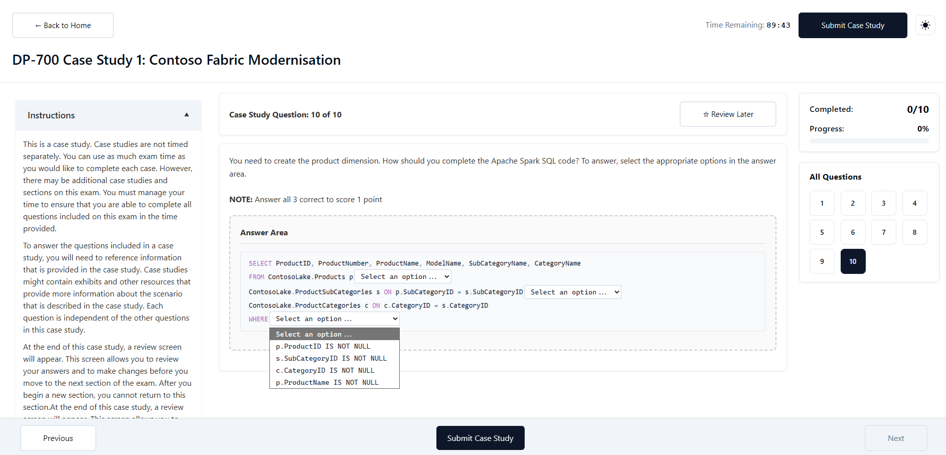
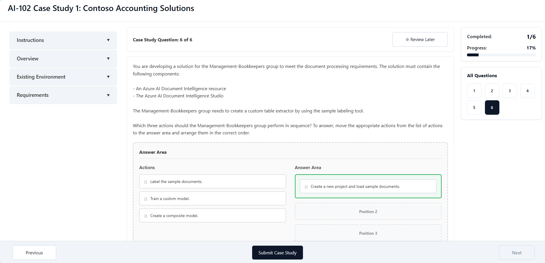
Is the exam experience clear, focused and easy to navigate?
Can the student understand what went wrong?
Does the next step feel clear after passing readiness checks?
Is the student confident they are ready for the real exam?
Can the student see progress over multiple attempts?
Does the platform guide the student towards what to revise next?
I gathered product requirements by observing how students, trainers and support staff interacted with the existing process. The biggest issues were not just visual design problems — they were journey problems. Students needed clearer feedback loops, support teams needed better visibility, and the business needed a platform that could scale without relying on manual explanation.
Students needed better guidance after completing a mock exam.
Results needed to show more than a pass/fail percentage.
Question review needed to make mistakes easier to understand.
Support staff needed consistent data to answer student queries.
Trainers needed a cleaner view of where learners were struggling.
The platform needed a scalable content structure for future courses.
Students could complete training activity without always knowing what to do next or whether they were ready to move forward.
Mock exam results gave useful information, but the experience needed to make mistakes, topic gaps and revision priorities easier to understand.
Support teams had to answer repeated questions that the platform could solve through clearer UX, better progress visibility and structured guidance.
As more courses, mocks and content were added, the platform needed a cleaner structure that could grow without becoming harder to manage.
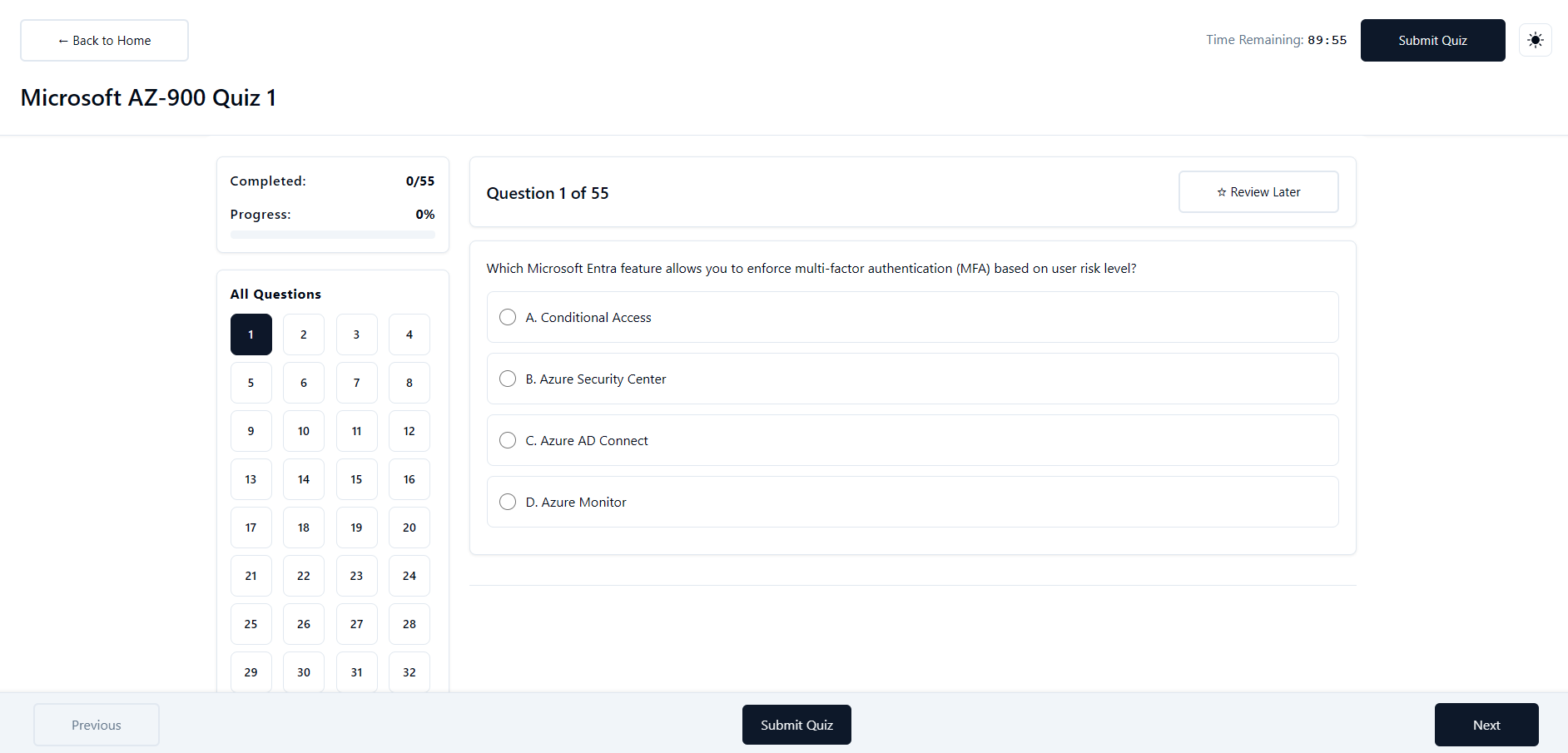
Before building the new experience, I mapped the key screens and user flows around what students needed to understand at each stage: where they were, what they had completed, what they got wrong, and what action they should take next.
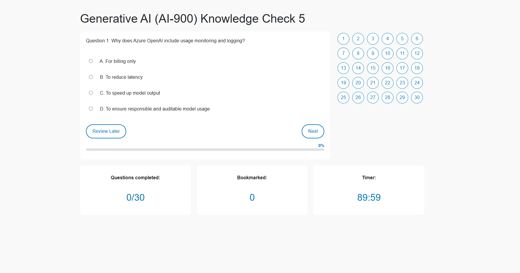
I simplified the quiz interface so students could focus on the question, navigate between questions, and review progress without unnecessary friction.
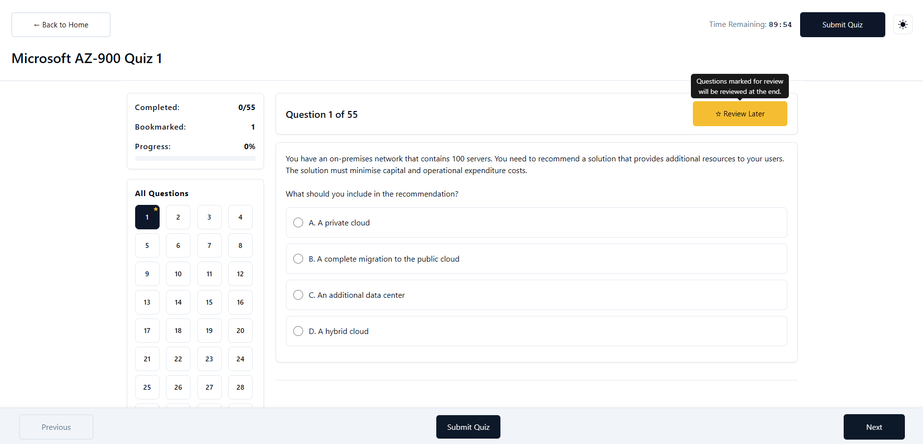
I added clearer question states and navigation patterns so students could move through longer mock exams with more confidence.
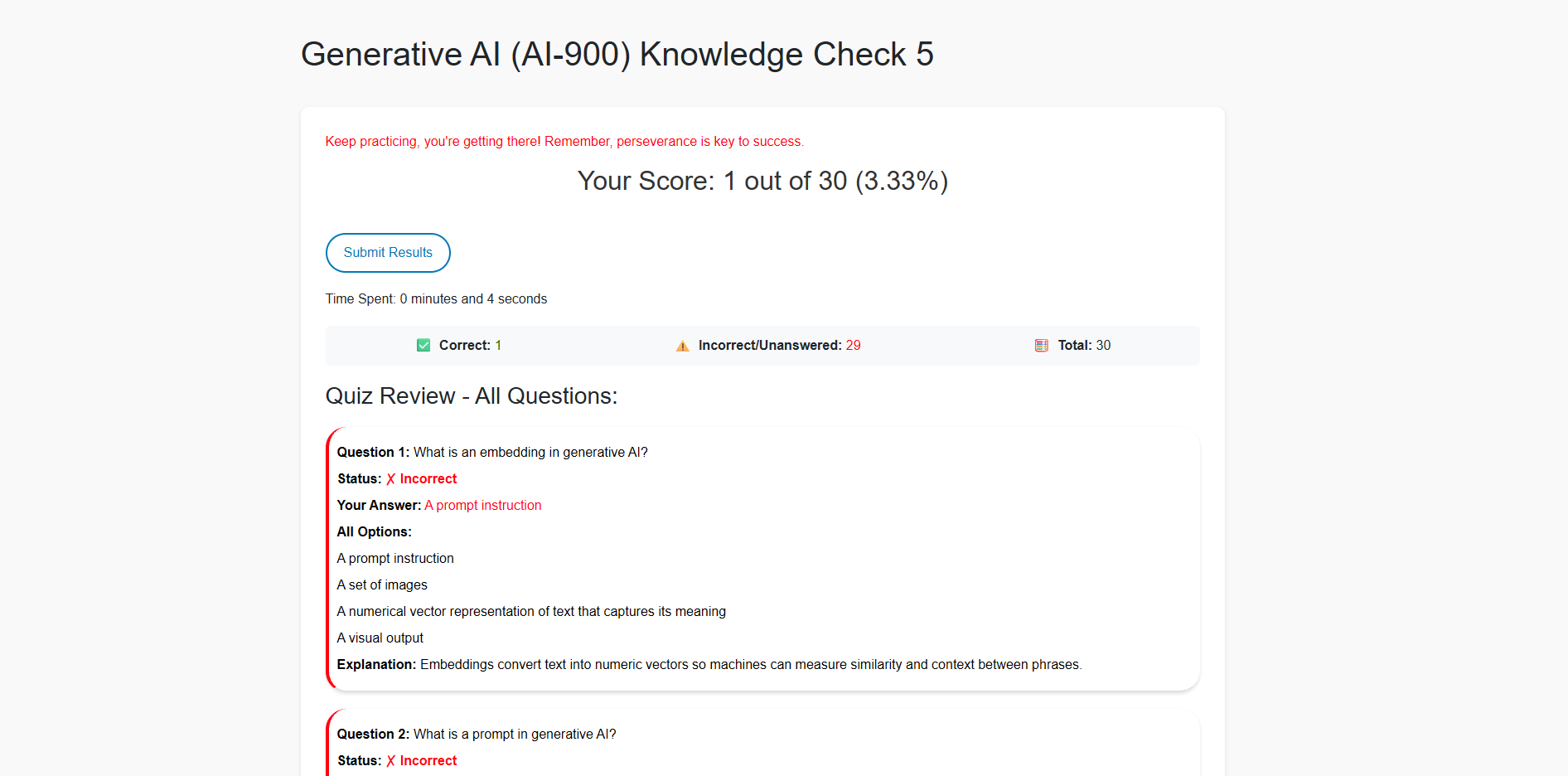
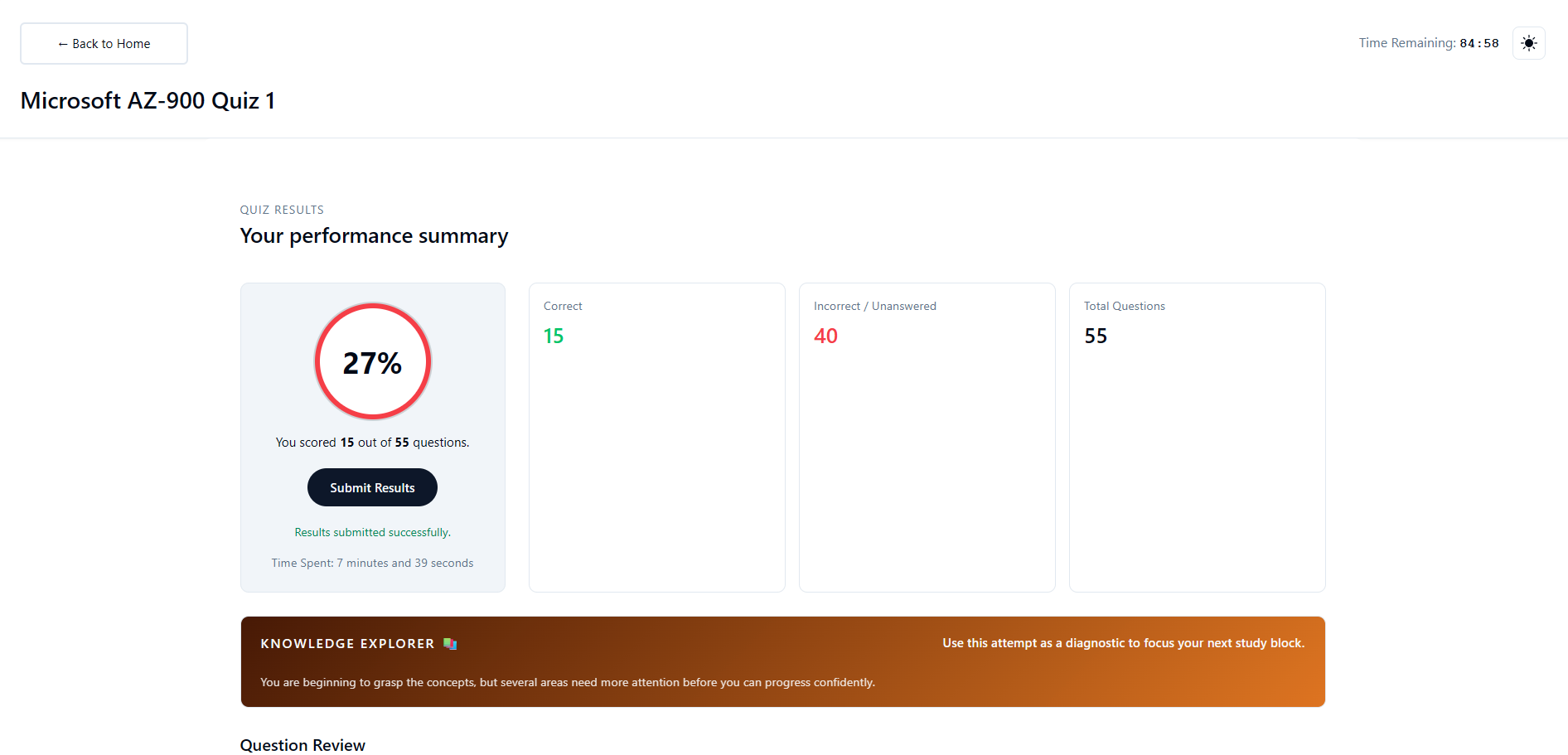
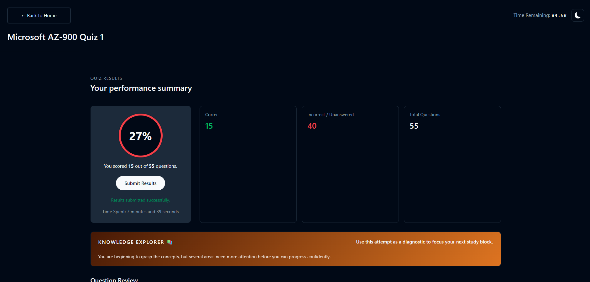
I redesigned the results view to make performance easier to understand at a glance, including score, correct answers, incorrect answers and unanswered questions.
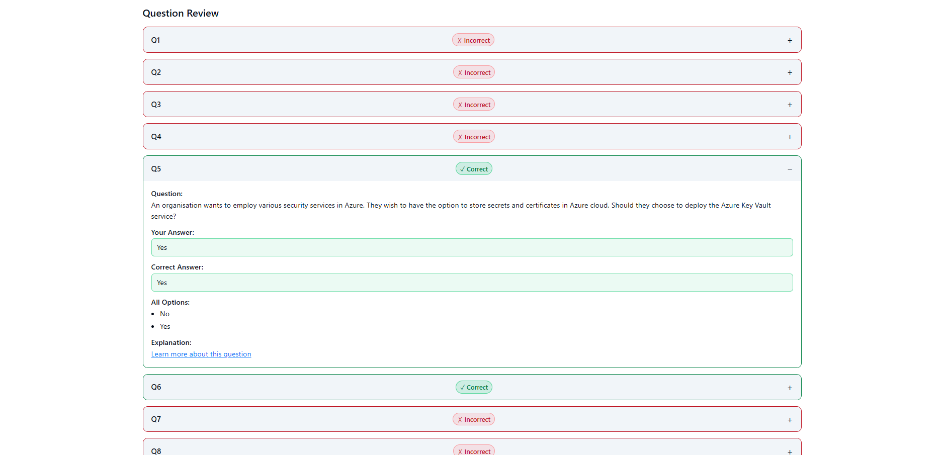
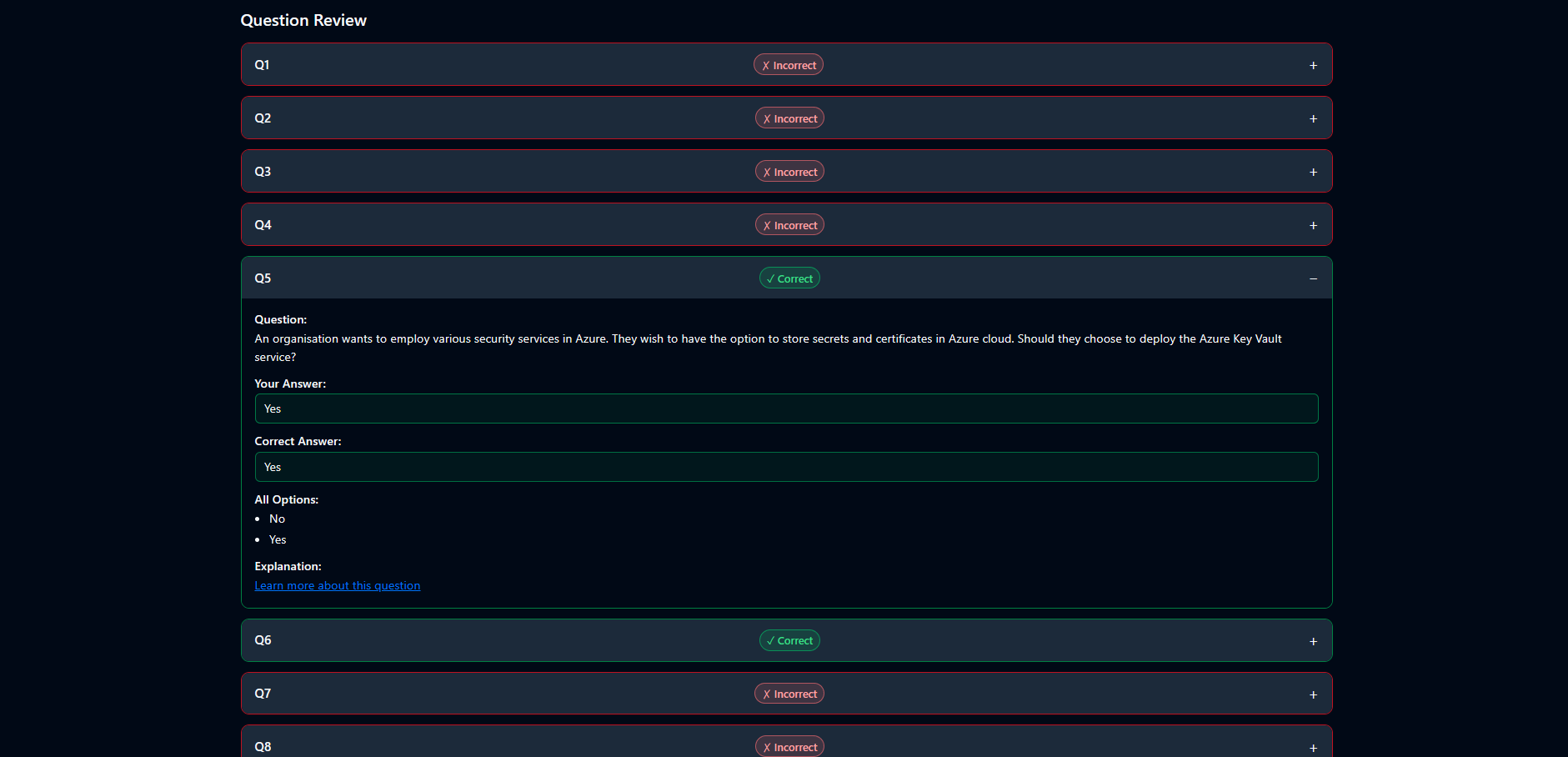
I introduced a clearer review structure so students could see which answers were correct or incorrect and use that feedback for targeted revision.
I explored dark mode layouts to improve comfort and accessibility for longer study sessions.
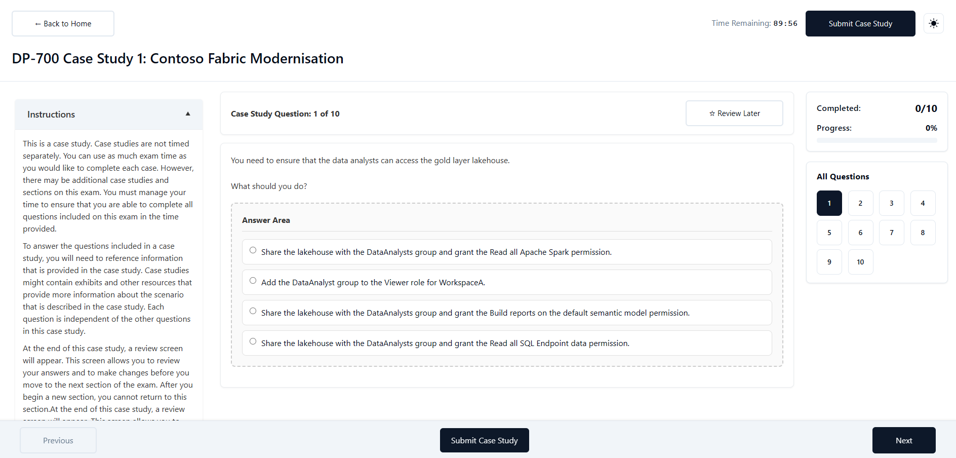
I introduced clearer case study layouts to support scenario-based learning and revision.
The redesigned experience brought mock exams, results, review flows and revision content into a more consistent platform journey. The focus was not only on making the screens look better, but on helping students understand what happened, what it meant, and what they should do next.
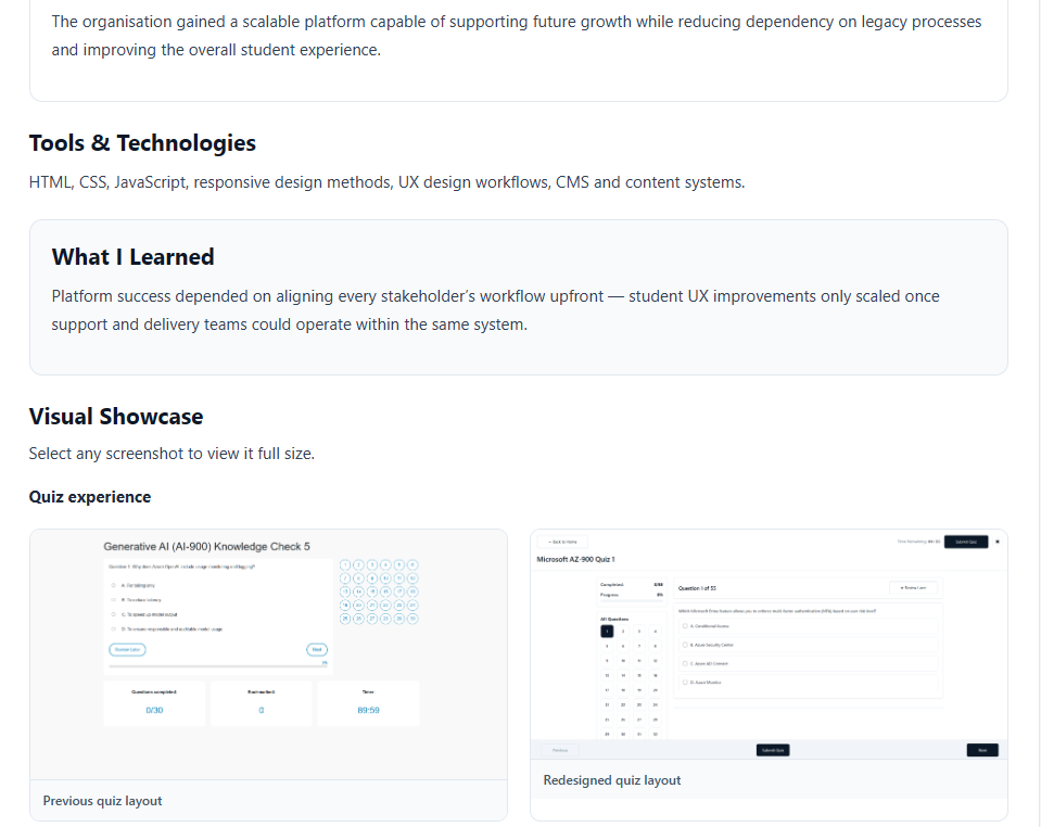
Select any screenshot to view it full size.
The previous quiz experience was functional but did not clearly support longer exam navigation or revision behaviour. The redesigned experience focused on question clarity, progress visibility and easier review.
The results experience was redesigned to turn exam completion into a feedback loop. Instead of simply showing a result, the new layout helped students understand performance, identify mistakes and decide what to revise next.
Scenario-based case study content was structured to support deeper learning and help students apply knowledge in a more realistic context.
Clearer exam navigation, results feedback and revision guidance helped students understand what to do next.
Better visibility and clearer self-service guidance reduced the need for repeated manual explanations.
The improved structure created a foundation for adding more courses, mock exams and content types.
Results became more actionable by connecting scores, incorrect answers and review behaviour.
A shared platform experience helped align students, trainers, support and management around the same journey.
I worked across product planning, UX design and frontend implementation, turning platform requirements into usable screens and scalable interface patterns. The build required balancing student-facing UX with internal operational needs, ensuring that the platform could support multiple stakeholders rather than solving for one screen in isolation.
The biggest lesson was that platform modernisation is not just about replacing old screens. It requires understanding how every stakeholder moves through the system. Student UX improvements only become truly valuable when they also support trainers, support staff and management workflows.
If continuing the project, I would focus on deeper learning analytics and personalised progression journeys, helping students understand not only what they scored but how their performance changed over time.
Case Study 5
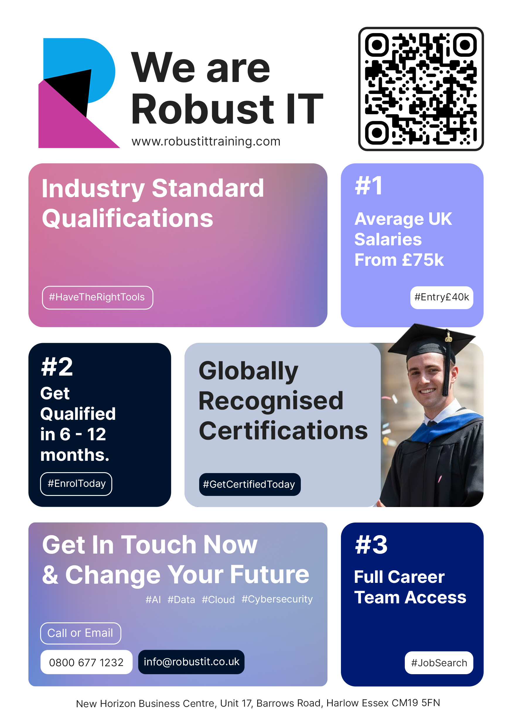
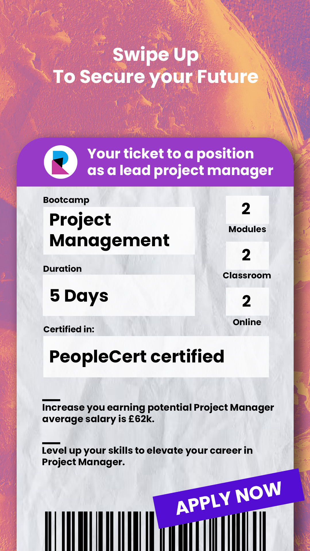
Delivered high-performing digital creative for webinar, paid social, and promotional campaign outputs.
The team needed consistent creative output that balanced speed, visual quality, and conversion performance across webinar, paid social, and organic channels.
I was responsible for campaign creative direction, mobile-first design optimisation, and brand consistency across social and landing assets.
I designed around attention hierarchy, CTA clarity, and message relevance for cybersecurity, cloud, AI, and data campaigns, then iterated layout and headline structures based on placement performance.
I built reusable creative templates so the team could deploy assets faster without sacrificing quality.
Achieved higher consistency across paid and organic channels, faster deployment through reusable systems, and improved readability and engagement in mobile placements.
Adobe Creative Suite, Canva, Figma, Photoshop, Illustrator, Meta Ads, LinkedIn campaign tooling.
Select any image to view it full size.










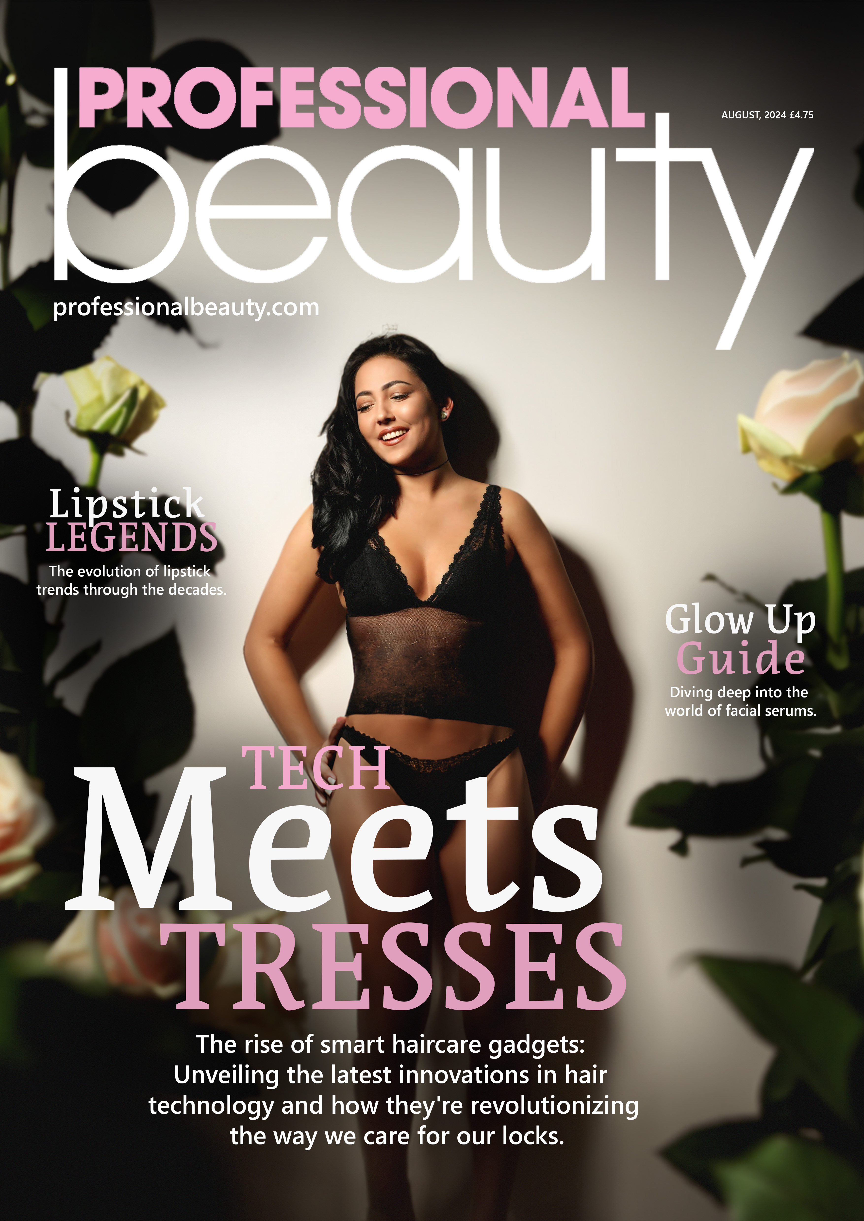


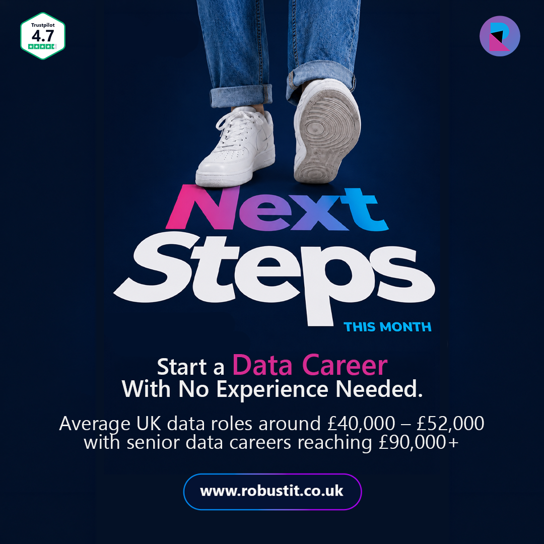





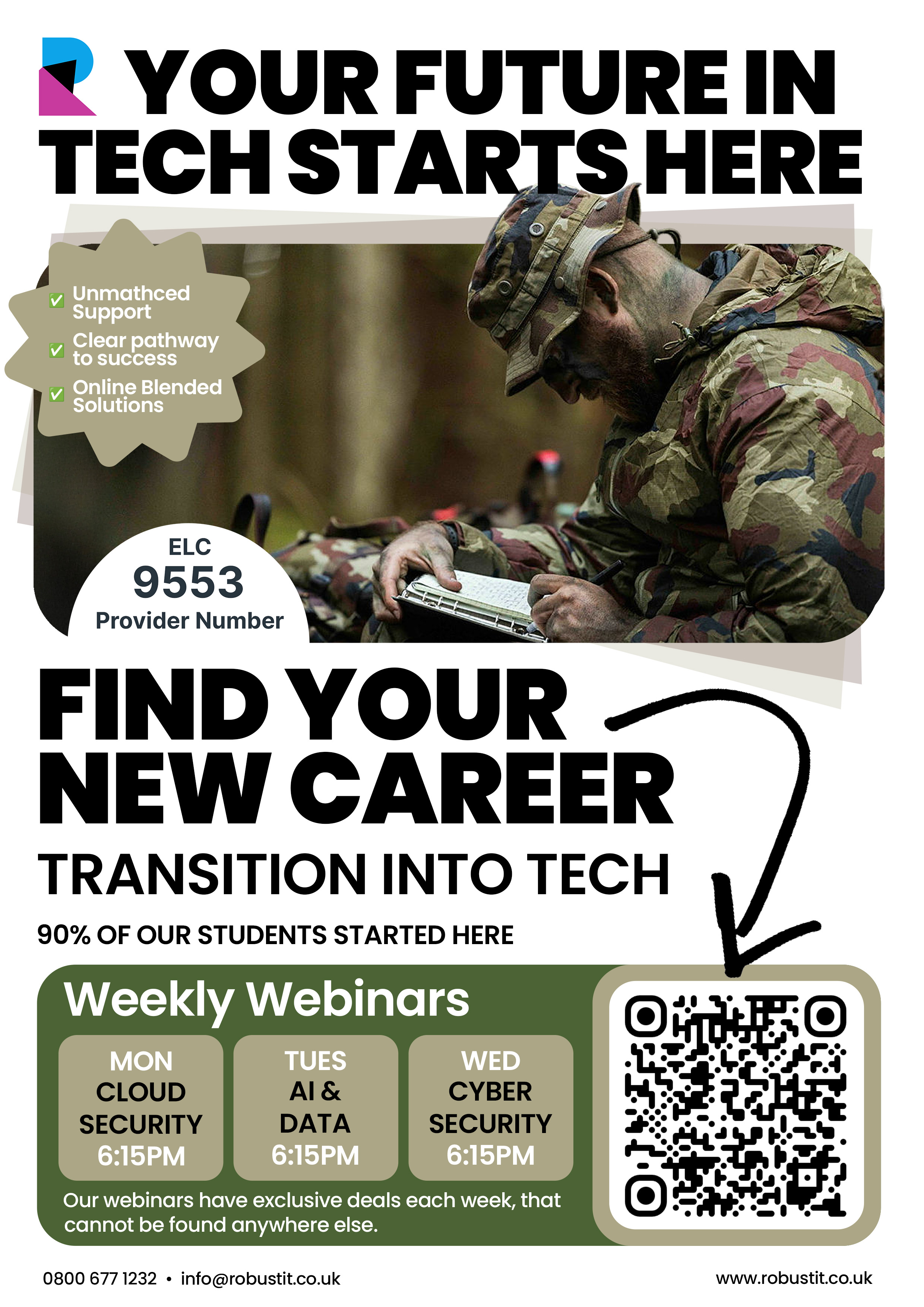
Case Study 6
Created a complete visual identity and social direction for a drum and bass podcast concept.
A new drum and bass podcast concept needed to stand out in a saturated market while remaining adaptable across podcast artwork, social posts, and promotional formats.
I was responsible for end-to-end brand identity, creative direction, and scalable social application guidance.
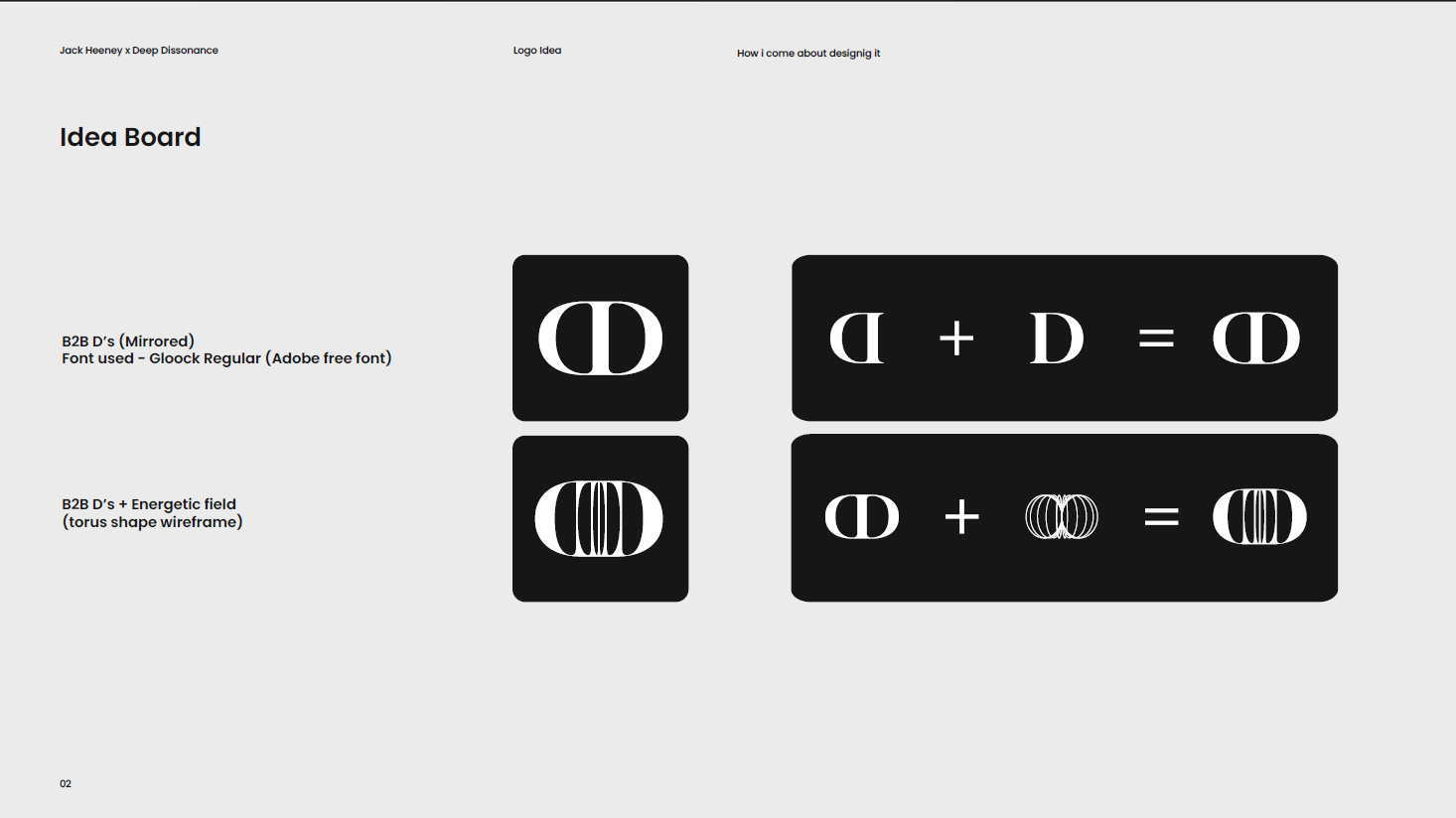
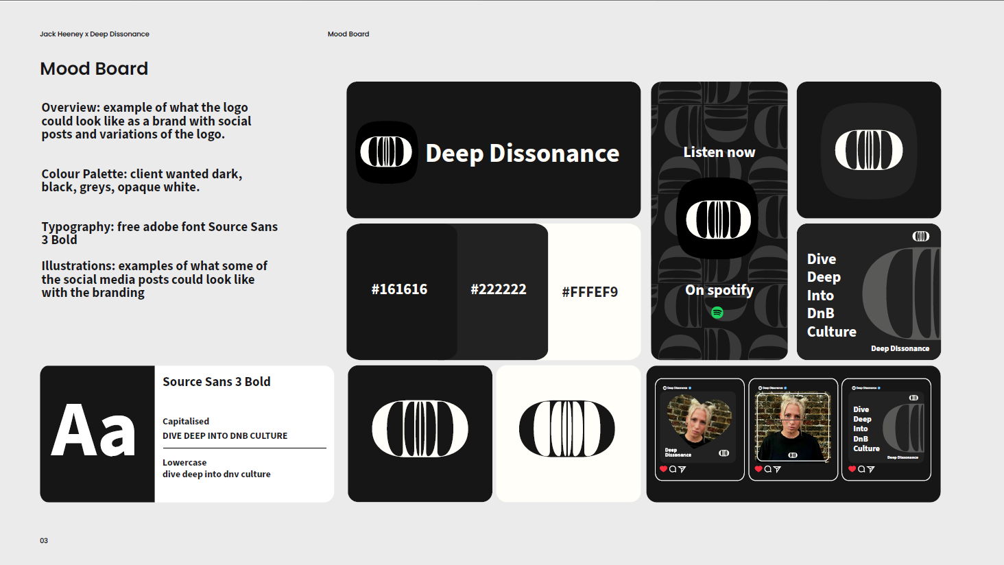
I led logo exploration, mood boarding, and visual language definition, then developed a dark, high-contrast system with recognisable type treatment and structured social templates.
Delivered a complete and scalable brand identity system, established a recognisable visual language for digital channels, and created reusable templates for ongoing content production.
Adobe Illustrator, Adobe Photoshop, Figma, typography systems, layout design and social mock-up workflows.
Select any image to view it full size.
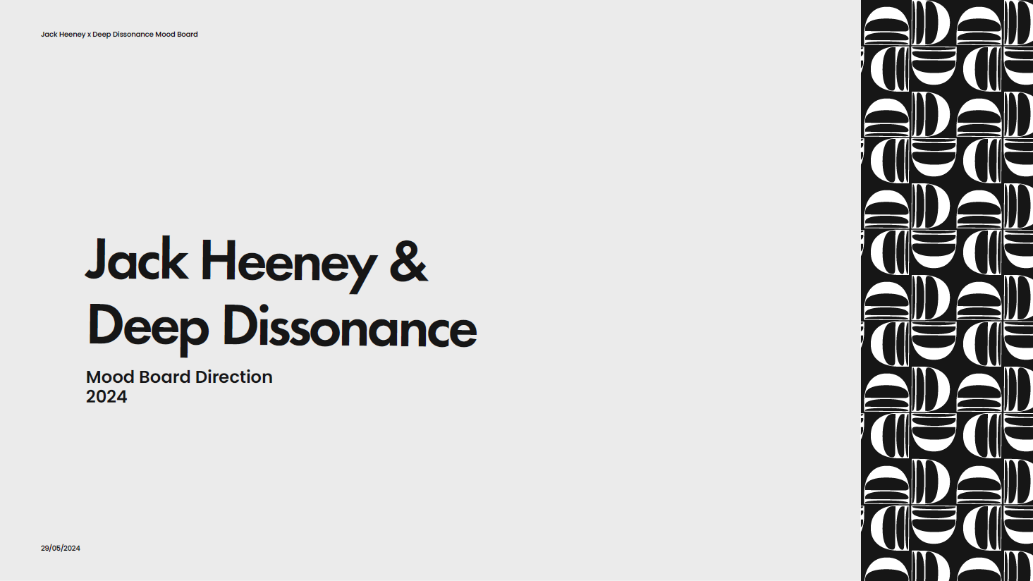








Case Study 7
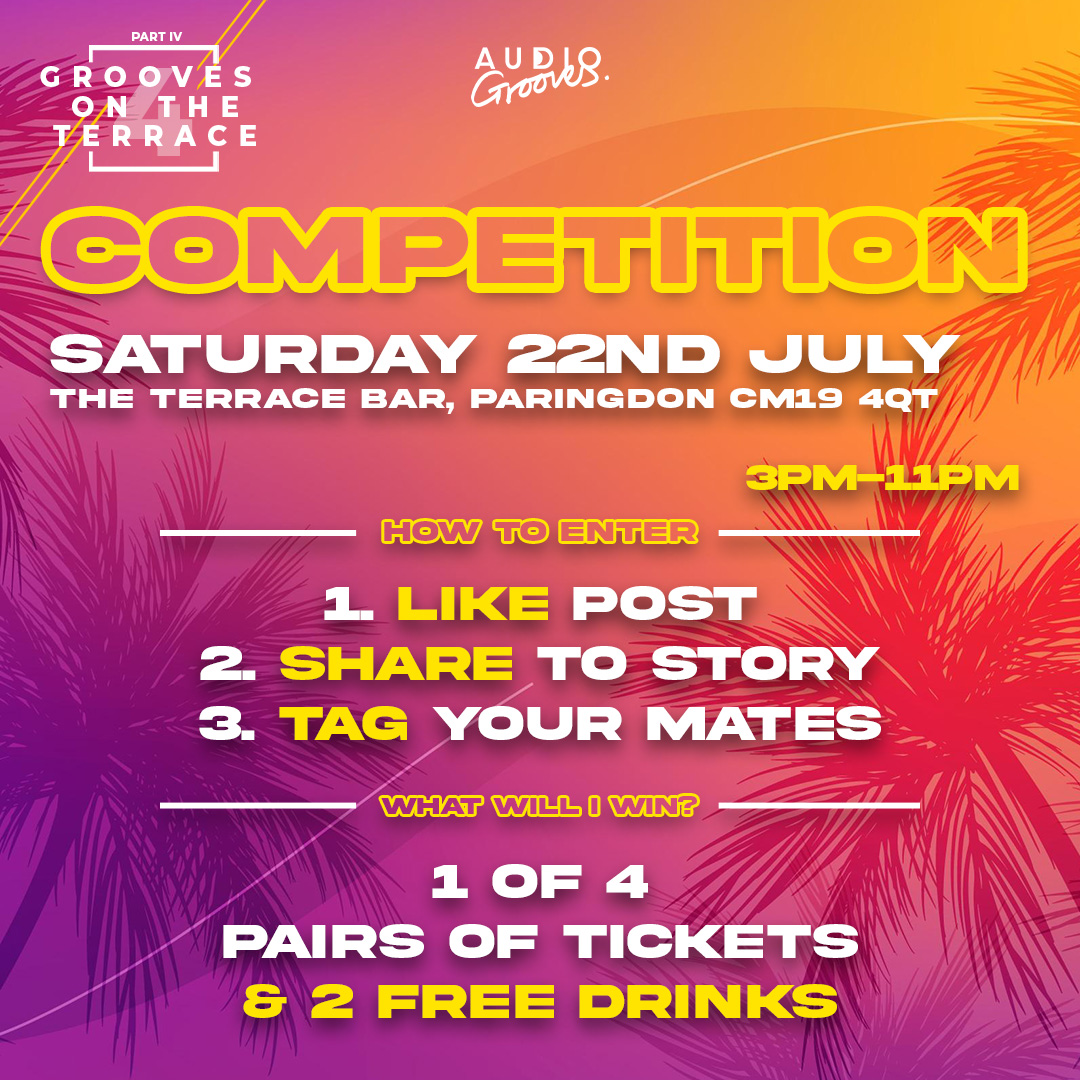
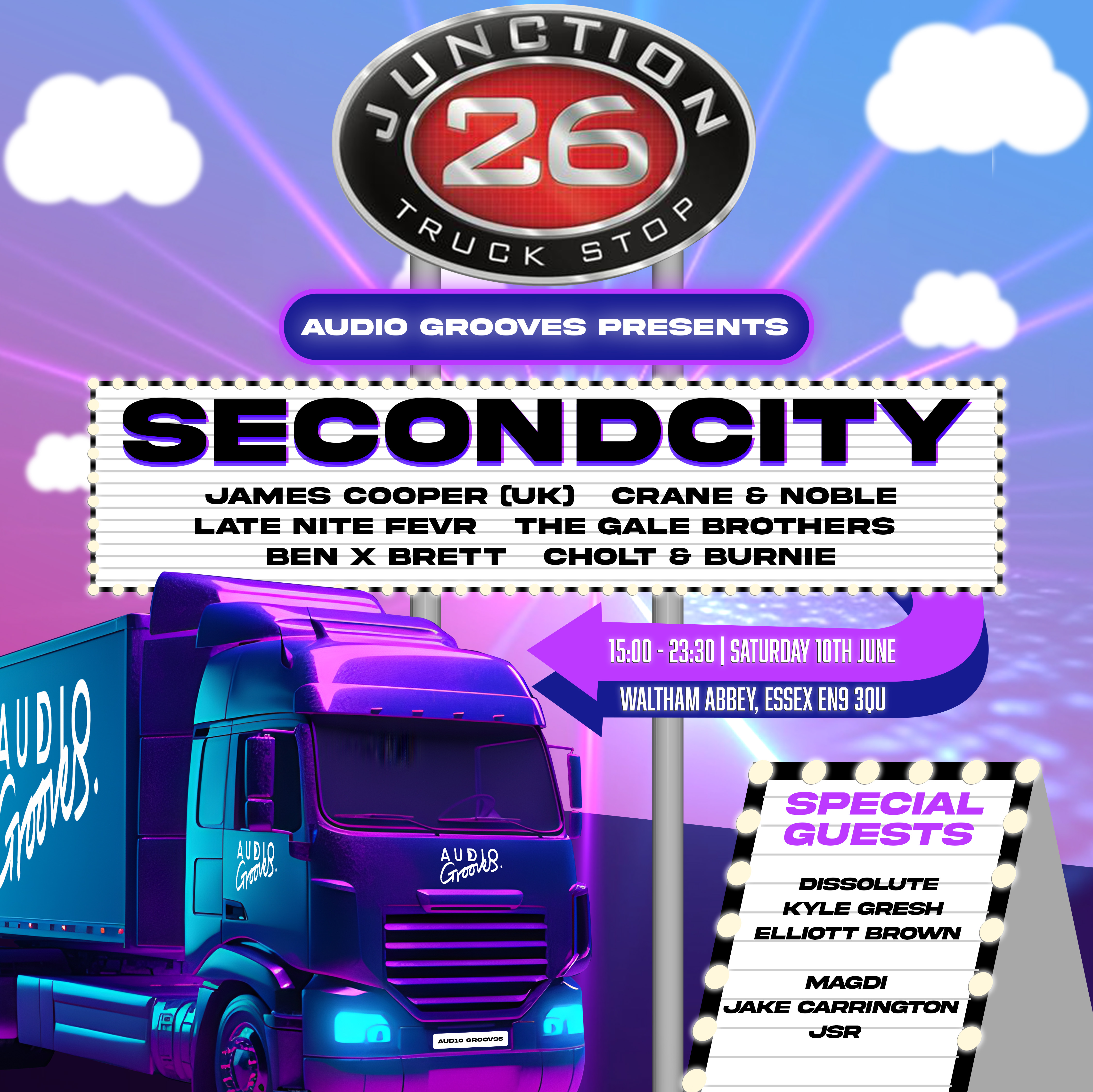
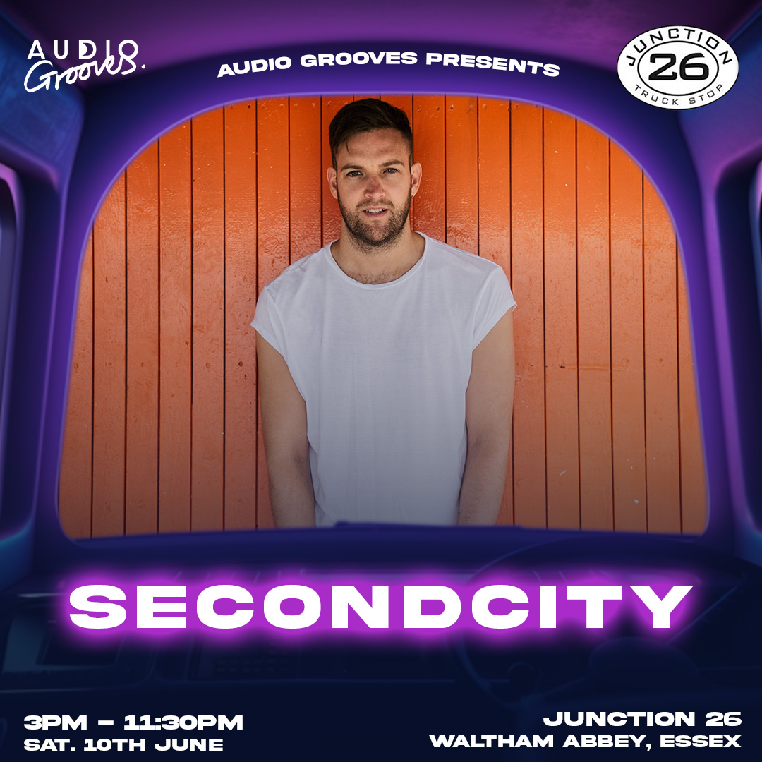
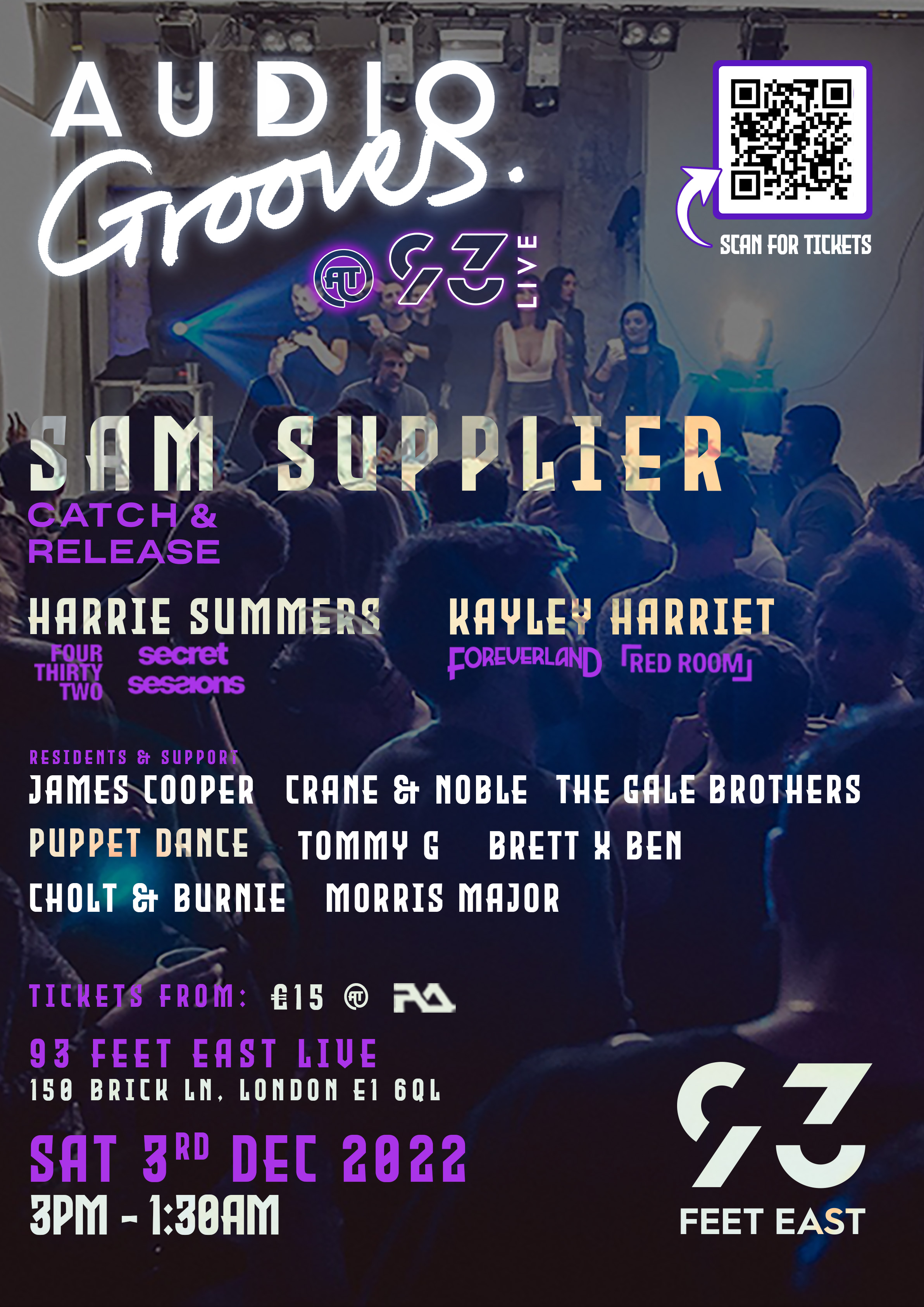
Designed the label logo and supported advertising, marketing, and creative production for club nights and label events.
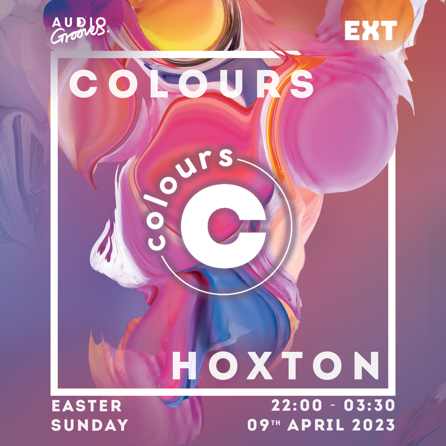
AudioGrooves, an independent music label, needed consistent advertising and creative support to promote club nights, label showcases, and artist events — with limited in-house design capacity and tight turnaround between announcements and show dates.
I was responsible for designing the AudioGrooves label logo and helping run event advertising and marketing alongside end-to-end creative production: event posters, promotional graphics, and after-party recap films.
I designed the AudioGrooves logo and brand mark, establishing a recognisable visual identity that carried through posters, social assets, and event collateral.
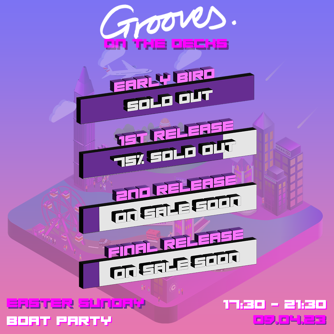
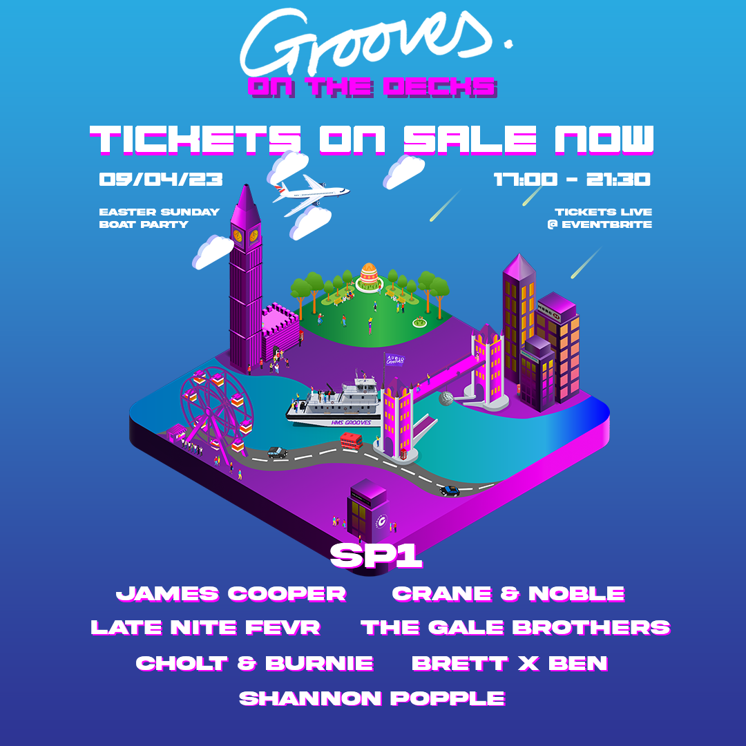
I planned and executed paid and organic campaign workflows across social platforms, designing event posters and promotional graphics aligned to the label brand and each night's visual identity.
I produced after-party recap videos from event footage for post-show promotion and audience retention, and built reusable templates so recurring event formats could be turned around faster without losing quality.
Delivered a cohesive label identity from logo through to campaign creative, maintained consistent promotional output across multiple events, and extended reach beyond the night itself via after-party content.
Adobe Photoshop, Adobe Illustrator, Adobe Premiere Pro, After Effects, Meta Ads, social campaign tooling, logo design, typography and layout systems.
Select any image to view it full size. Videos play inline with controls.




Case Study 8
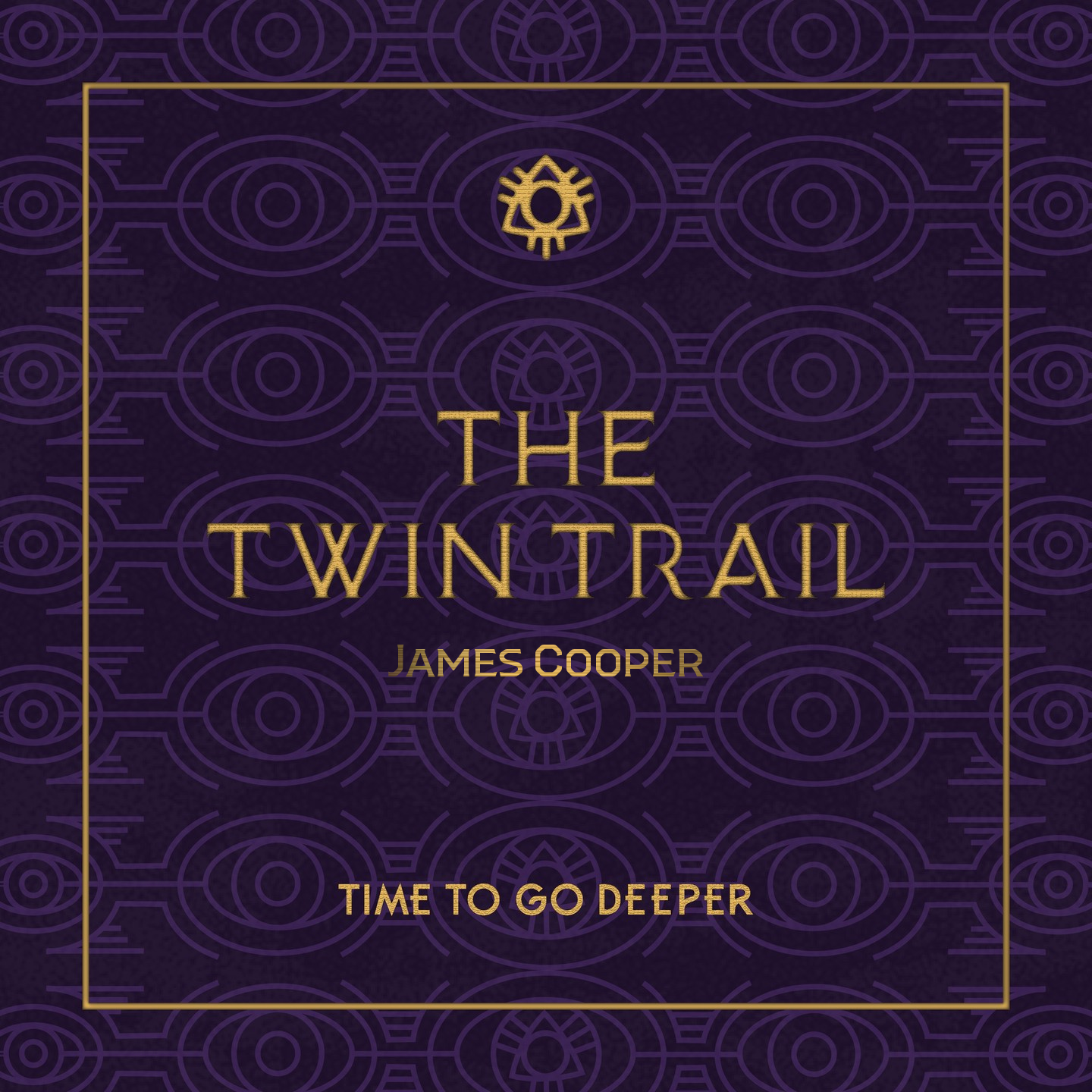
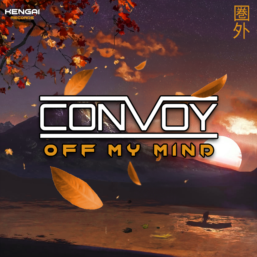
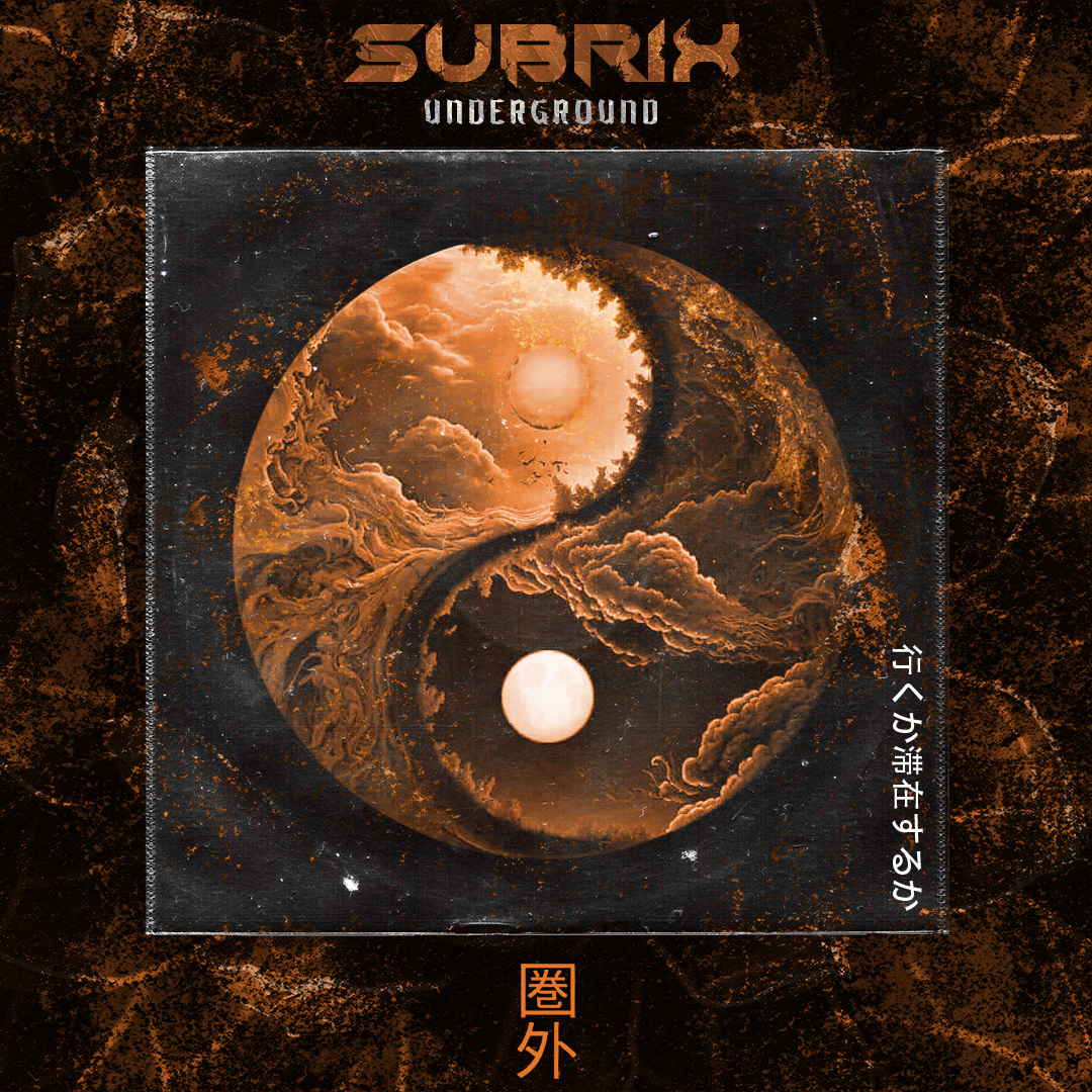
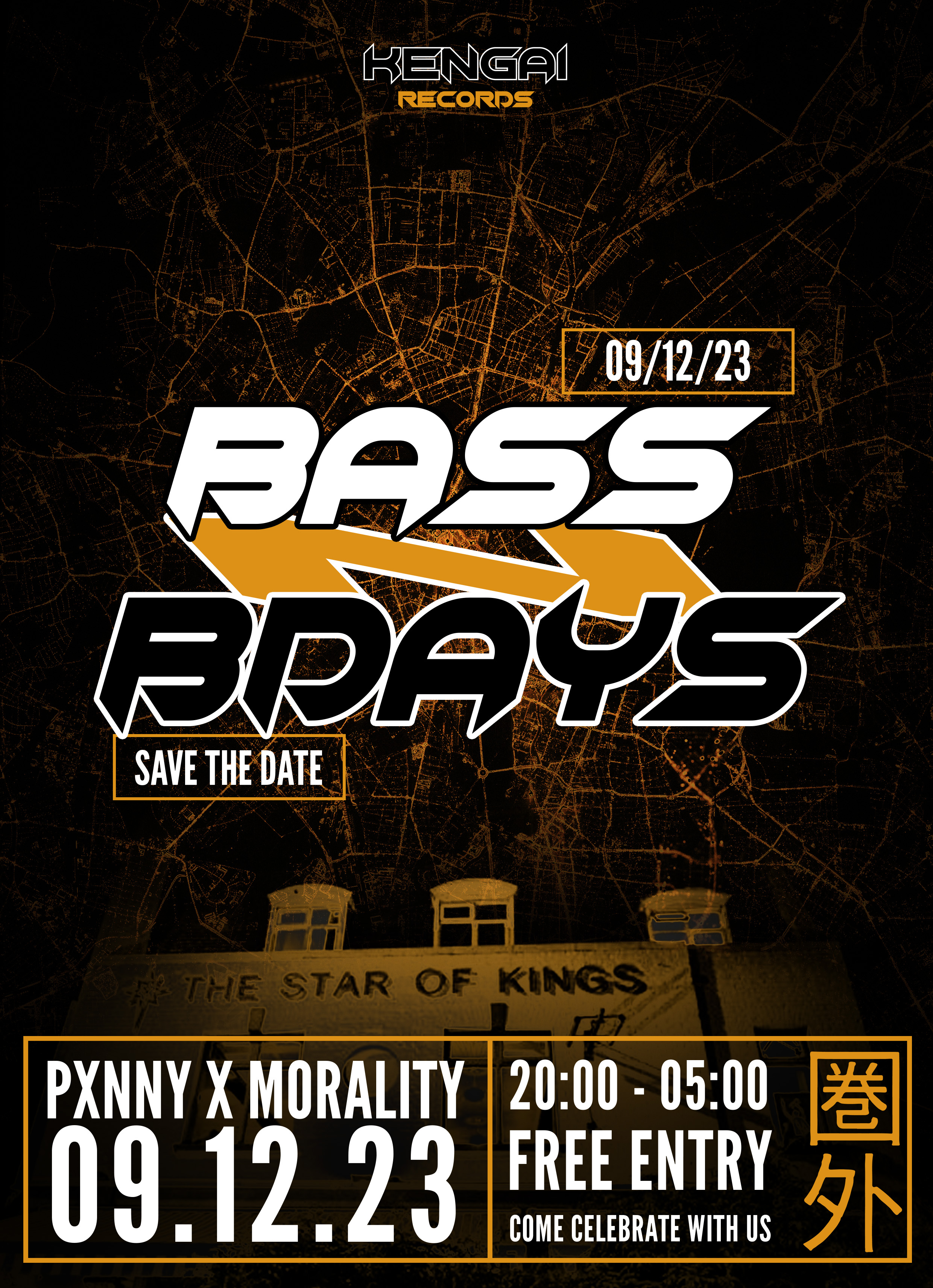
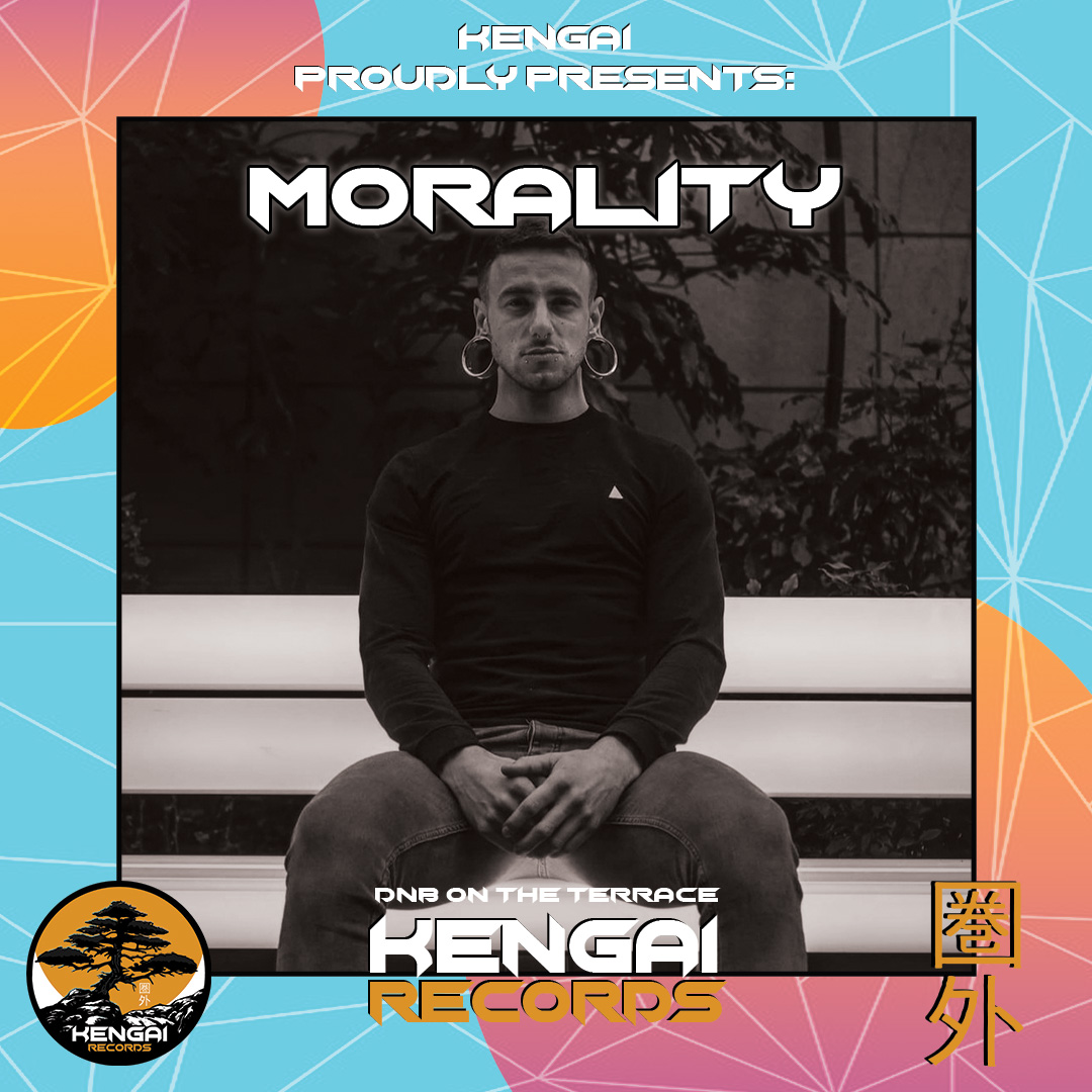
Designed release artwork, event collateral, and connected Instagram carousel posts for an independent electronic music label.
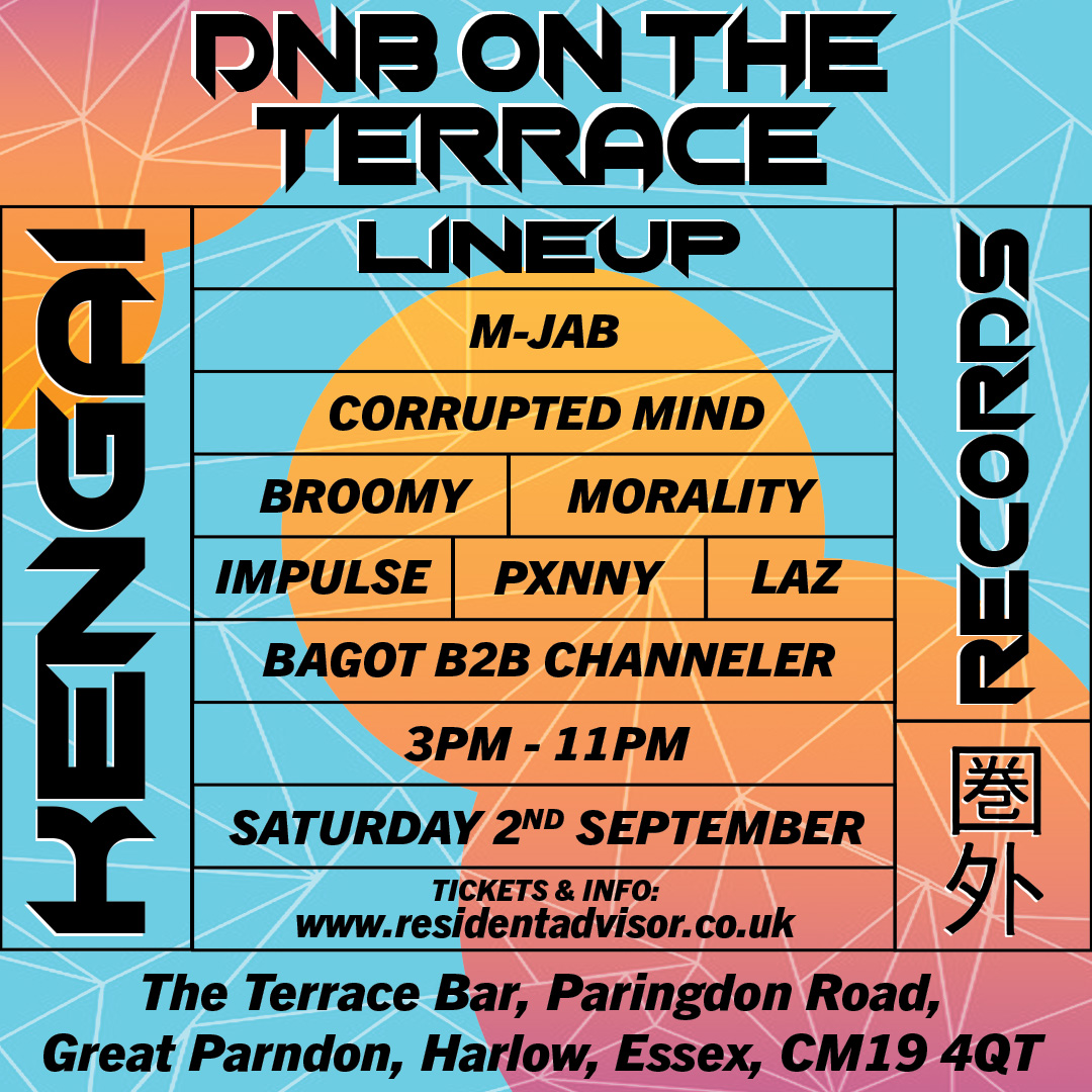
Kengai Records, an independent electronic music label, needed consistent creative support for artist releases and club-night promotions — with artwork, social assets, and event flyers required on tight turnarounds between announcement and release or show dates.
I was responsible for designing label release artwork, event promotional materials, and social campaign graphics — including multi-slide Instagram connected posts that could carry longer release narratives across a single swipeable carousel.
I produced single and EP release artwork aligned to each artist's sonic identity and the Kengai visual language, from cover art through to promotional variants for streaming and social.
I designed event flyers, save-the-date graphics, and venue-led promotional assets for label nights and showcases.
I built connected Instagram carousel sequences — artboards designed to scroll as one continuous post — so release stories, line-ups, and event details could be communicated without cramming everything into a single frame.
Delivered a cohesive stream of release and event creative across multiple artists and nights, with reusable carousel formats that made longer promotional stories easier to publish and browse on social.
Adobe Photoshop, Adobe Illustrator, typography and layout systems, social asset sizing, and Instagram carousel post workflows.
Swipe through the connected Instagram carousel below. Select any other image to view it full size.
Swipe or use the arrows to scroll through connected posts — designed as one continuous Instagram carousel.
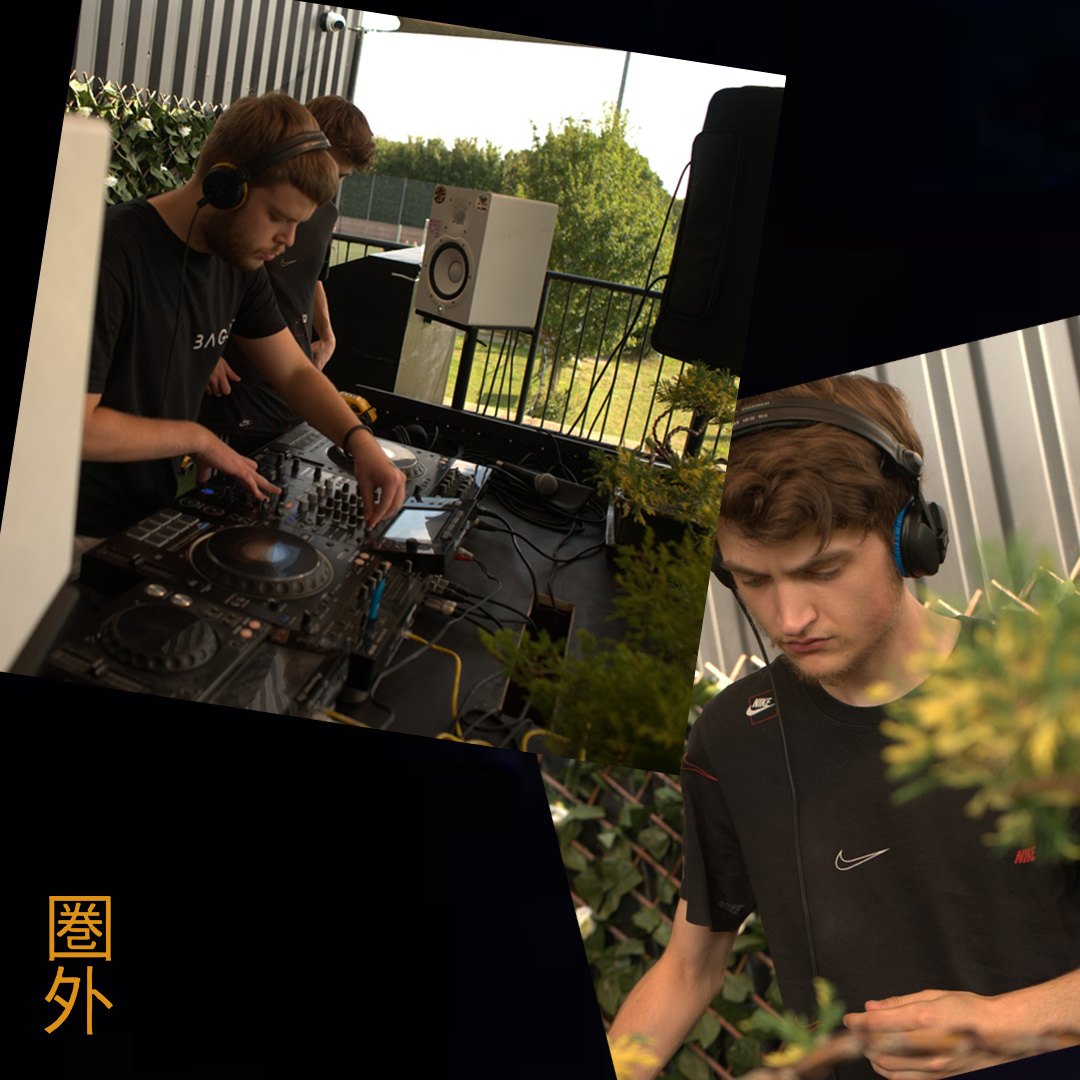

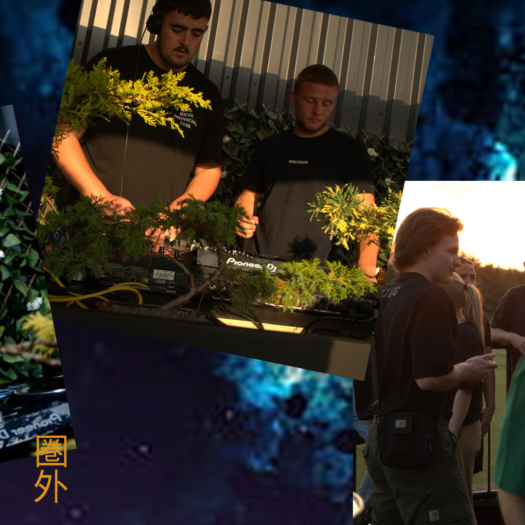
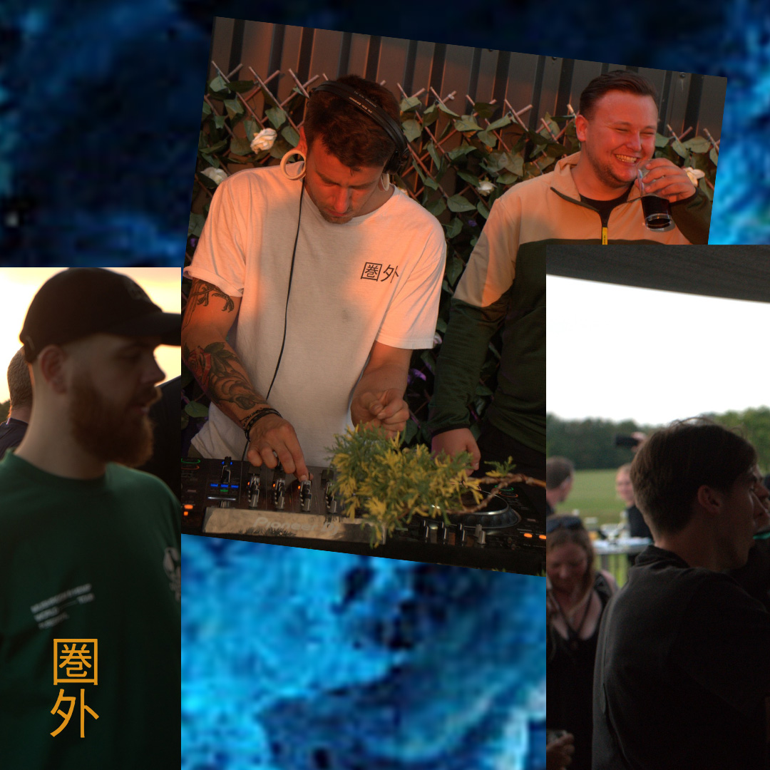
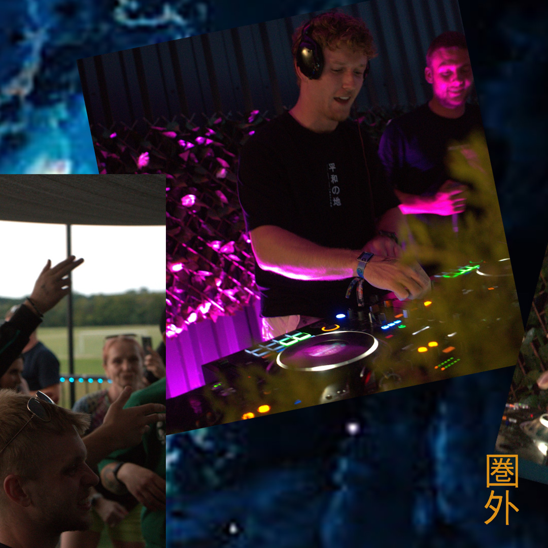

Connected Instagram carousel — multi-slide release and event announcement sequence


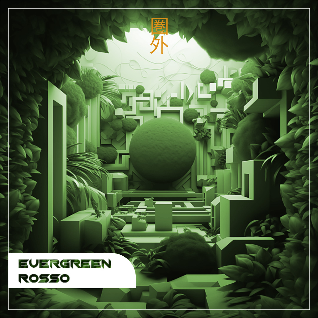
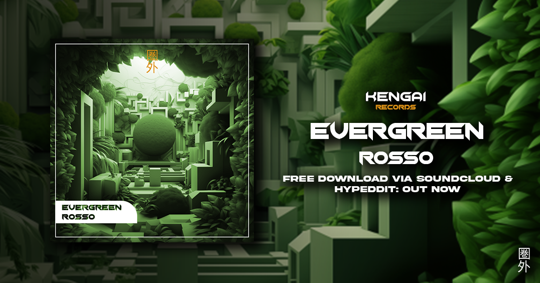




Case Study 11
Designed and built a nostalgic Windows-style desktop portfolio that demonstrates product thinking, frontend craft, and recruiter-friendly case study storytelling.
Most portfolio sites follow the same scrollable template — clean, but easy to skim past. I needed a personal site that would stand out in hiring conversations, demonstrate hands-on product and frontend skills, and present project work in a format recruiters already use when evaluating candidates.
I set out to design and build a distinctive portfolio experience: a nostalgic desktop metaphor that feels playful without sacrificing clarity, with structured STAR case studies, live website previews, document access, and onboarding for first-time visitors.
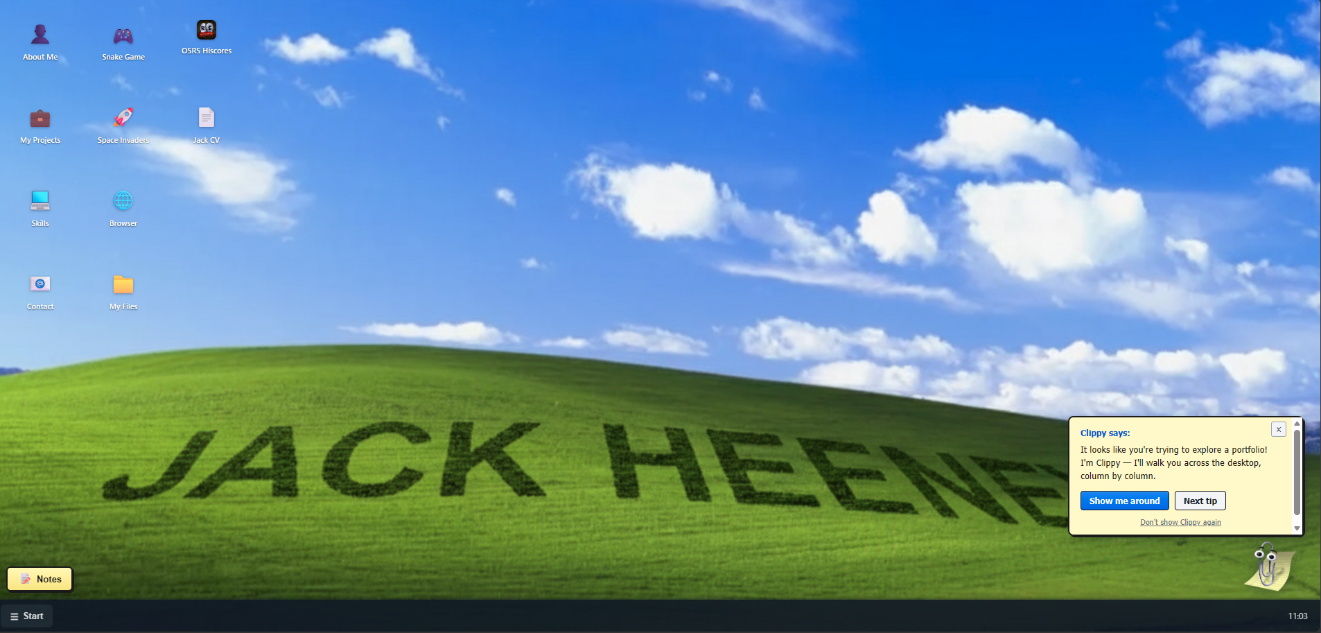
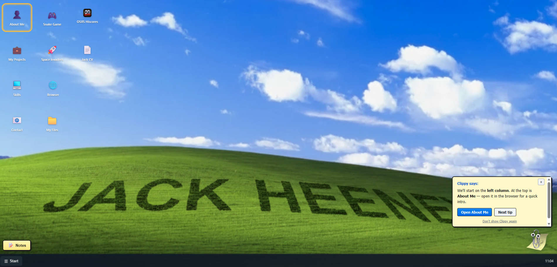
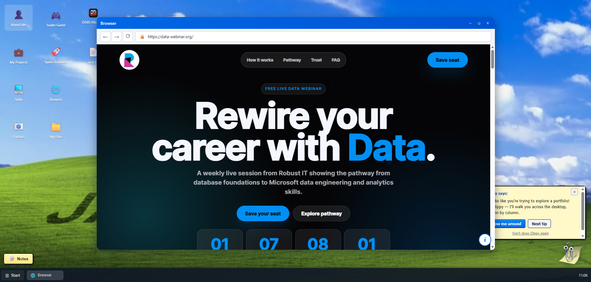
I conceived a Windows XP-inspired desktop with login screen, Bliss wallpaper, draggable windows, taskbar, and Start menu — mapping portfolio content to familiar desktop affordances (projects in the browser, CV in My Files, contact via desktop icons).
I built a modular window system in vanilla JavaScript and PHP, including a browser app that hosts the portfolio site, STAR case study pages with visual showcases, and iframe previews of live client websites.
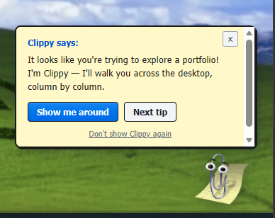
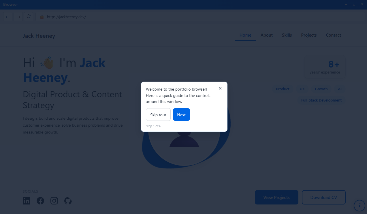
I designed two guided tour layers: a Clippy assistant that walks visitors across the desktop column by column, and an in-browser tour that explains navigation controls without breaking immersion.
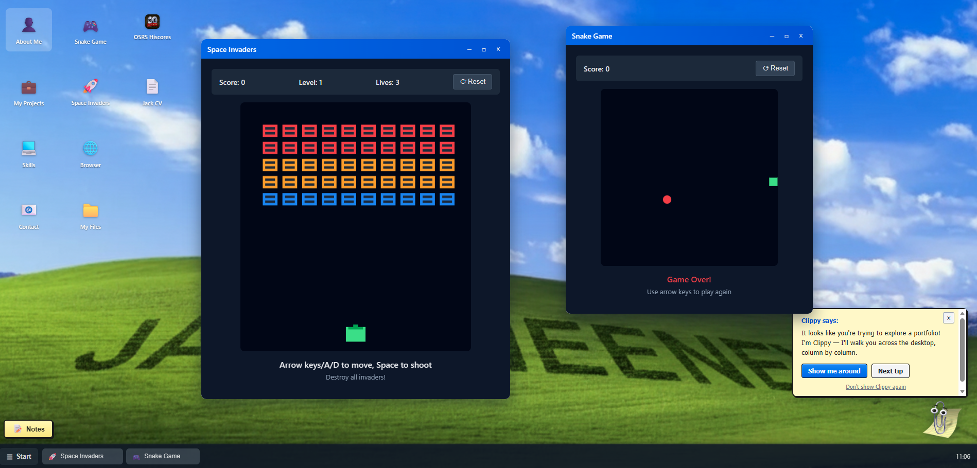
I added interactive touches — Snake and Space Invaders mini-games, OSRS hiscores, sticky notes — to showcase frontend capability and personality, while keeping core hiring content one click away.
Delivered a memorable, self-contained portfolio product that doubles as a skills demonstration: UX design, frontend engineering, content structure, and attention to hiring-manager workflows in one cohesive experience.
HTML, CSS, JavaScript, PHP, responsive layout, window management UI, local storage, iframe embedding, and UX prototyping workflows.
Nostalgia only works when it serves a job — every desktop icon and window had to map to a clear portfolio goal, or the concept would have been a gimmick instead of a usable product.
Select any screenshot to view it full size.
Feel free to reach out if you'd like to work together or just say hello!
IM_KOFI
Jagex no longer allows this site to be embedded in a frame. Stats are loaded from the official API instead. Open full profile on runescape.com
| Skill | Rank | Level | XP |
|---|